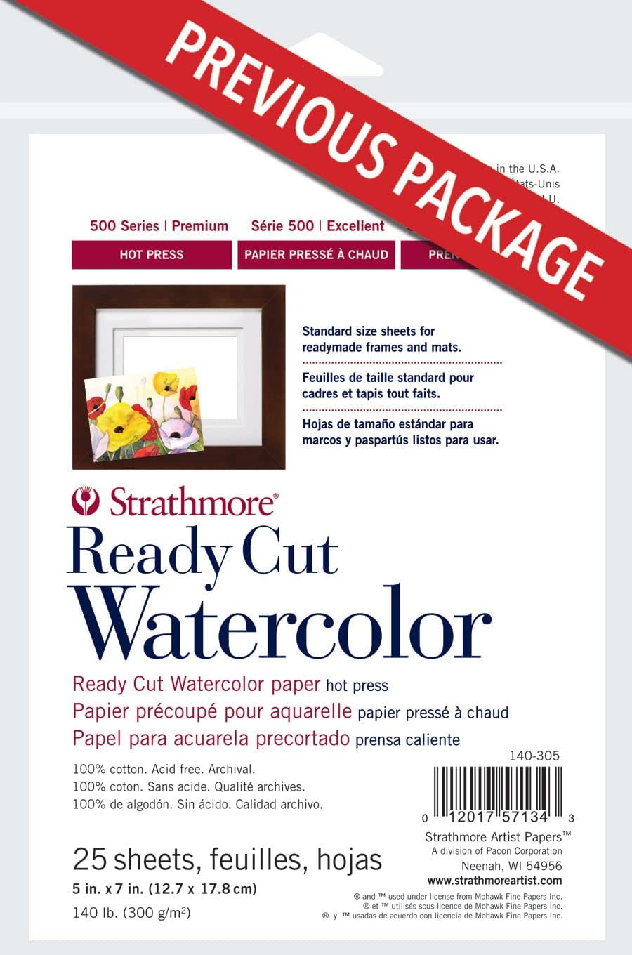
You buy a premium sheet of hot-press watercolor paper — hot press means the surface is smooth and calendered (rolled under heated cylinders), as opposed to cold press, which has visible texture. You lay down what should be a clean, even wash of pigment and water. Instead, the paint beads, crawls, and dries in streaks. You assumed this was user error. You try again. Same result. Then, buried in a review thread, someone mentions offhandedly that the sheet has two sides — and the one facing up behaves more like cold press than hot press. This is one of the most common and least-discussed discoveries intermediate watercolorists make, and it happens across multiple paper brands. This article explains why it happens, how to identify the working side before you paint, and which papers reviewers consistently call out as either solving or worsening the problem.
| EDITOR'S PICKFabriano Studio Watercolor Pad | Mid-tierCanson XL Series Watercolor Pap… | Budget pickStrathmore 300 Series Watercolo… | |
|---|---|---|---|
| Sheet count | 50 | 30 | 24 |
| Size | 9" x 12" | 11" x 15" | 9" x 12" |
| Surface | Hot-press | Cold-press | — |
| Format | Pad | Tape bound | Pad |
| Price | $27.48 | $19.69 | $10.83 |
| See on Amazon → | See on Amazon → | See on Amazon → |
Why Watercolor Paper Has Two Different Sides at All
Watercolor paper is made by one of two methods: machine-made (on a moving wire mesh belt) or mould-made (on a rotating cylindrical mould). Both processes create a structural consequence that matters to painters: the two faces of a single sheet are formed differently.
The side that contacts the wire mesh or mould during manufacturing picks up a texture from that surface. The opposite side — the “felt” side, which rested against the felt blanket used in pressing — develops a smoother, more uniform texture. On cold-press and rough papers, the difference between wire side and felt side is subtle enough that most painters never notice. On hot-press paper, where surface consistency is everything, the difference can be significant.
There’s a second variable layered on top of this: sizing. Sizing is a treatment — typically gelatin or synthetic equivalent — applied to paper to control how much water and pigment the fibers absorb. Sizing can be internal (mixed into the pulp during manufacture) or surface-applied (brushed or dipped on after the sheet is formed). Surface sizing is often applied unevenly between the two faces, or applied primarily to one side. Per the Handprint.com watercolor papers reference compiled by Bruce MacEvoy, surface sizing directly governs paint behavior: a well-sized surface lets washes sit and flow; an under-sized surface drinks pigment in quickly and makes corrections nearly impossible.
When sizing is applied more heavily to one face, the undersized face behaves noticeably differently — softer, more absorbent, sometimes almost rough-textured even on a nominally smooth paper. That’s the “cold press side” that Strathmore 500 Series hot press reviewers describe. Multiple verified purchaser reviews of that paper document repeated failed washes before the buyer discovered orientation was the culprit. That discovery isn’t in Strathmore’s packaging or product description. It’s in the reviews.
The Papers Where the Two-Sided Problem Shows Up Most
Not all papers are equally susceptible. Here’s a quick orientation across the papers your audience is most likely to be using or considering:
Strathmore 500 Series Hot Press This is where the pattern is most clearly documented in buyer reviews. Reviewers report that one side produces the tight, smooth behavior expected from hot press, while the other side behaves more loosely — absorbs faster, doesn’t hold lifting or layering as well, and can show texture where none should be. The Jackson’s Art Blog editorial overview on paper selection notes that even quality mill papers can exhibit this asymmetry, particularly in hot press grades where surface consistency tolerances are tightest. If you’re using 500 Series hot press and getting inconsistent results between sessions, orientation is the first variable to check.
Fabriano Artistico Hot Press Calligraphers and illustrators who rely on surface smoothness — where a single uneven stroke is visible — consistently flag surface consistency as critical in Fabriano Artistico reviews. Multiple reviewers note that the preferred working side is identifiable by its slightly brighter appearance and more uniform sheen under raking light. The Artists Network guide on watercolor paper types notes that Fabriano’s traditional mould-made process produces a more consistent sheet than machine-made alternatives, but the two-sided difference still exists; it’s simply smaller in magnitude.
Arches Cold Press and Hot Press Arches is the benchmark most professional reviewers return to. Purchasers who use Arches in block form (sheets pre-glued together on all four edges, so they can’t warp when wet) consistently note that the block always presents the correct working side face-up. This is a meaningful practical advantage — it removes orientation uncertainty from every session. Artwork Archive’s archival standards resource for works on paper identifies Arches as one of the reference standards for cotton-rag archival surfaces, which also means its sizing consistency is subject to tighter mill quality control than wood-pulp alternatives.
Canson XL At the student and intermediate-budget tier, Canson XL reviewers praise consistent sizing across sheets — meaning the two-sided variation is smaller and less likely to produce the dramatic behavioral difference that advanced-work hot press users encounter. For someone building daily practice or working through a lot of paper, that consistency matters more than surface prestige. The tradeoff is that Canson XL is wood-pulp, not cotton-rag, so it’s not archival — appropriate for practice, not for finished work you intend to sell or preserve.
How to Identify the Correct Working Side Before You Paint
The watermark method is the most reliable technique for mould-made papers. Hold the sheet up to a window. The watermark (if present) reads correctly — not mirrored — from the felt side, which is typically the intended working side. This is documented in Bruce MacEvoy’s Handprint.com paper reference as the standard identification method for Arches and comparable mill papers.
The surface sheen method works on hot press sheets where watermarks aren’t visible. Hold the paper at a low, raking angle to a light source. The working side typically shows a more uniform, subtle sheen. The wire side often shows faint parallel texture from the mesh.
The absorbency test is what many reviewers describe arriving at by accident. Drag a wet brush lightly across a corner of each side. The working side should hold the water briefly before it begins to absorb. The non-working side drinks it in faster. On hot press paper, this difference is immediately obvious.
For blocks: Arches and comparable block formats present the working side face-up by convention. Reviewers of Arches blocks consistently confirm this, noting that removing individual sheets from the block (using a palette knife to break the glue seal at the open edge) and maintaining the same orientation preserves this advantage. This is one of the underappreciated benefits of blocks beyond the more commonly cited “no need to tape or stretch” convenience.
By the Numbers
| Paper | Composition | Sizing type | Two-sided variation | Best use case |
|---|---|---|---|---|
| Arches 140 lb Cold/Hot Press | 100% cotton rag | Gelatin surface + internal | Low–moderate | Finished work, archival |
| Fabriano Artistico | 100% cotton rag | Gelatin surface | Moderate | Illustration, calligraphy |
| Strathmore 500 HP | 100% cotton rag | Surface sized | Moderate–high | Finished work (with orientation awareness) |
| Canson XL | Wood pulp | Internal sizing | Low | Practice, studies |
Variation ratings are drawn from aggregated buyer review patterns, not mill specification disclosures.
What This Means for Your Buying Decisions
If you’re doing work you intend to sell or archive, the two-sided issue is a professional variable, not a nuisance. Artwork Archive’s archival guidance notes that surface degradation often starts with inconsistent sizing, which means the “wrong” side of a premium sheet may not just paint differently — it may also age differently. For finished pieces, this matters.
The decision frame shakes out roughly as follows:
-
If you work primarily in hot press for illustration or detail work, Arches block format removes orientation ambiguity entirely and pairs the correct-side guarantee with the no-stretch convenience reviewers consistently praise. The cost premium over loose sheets is real but calculable against setup time and ruined sheets.
-
If you work in loose sheets and need to identify sides reliably, watermark orientation is the fastest method for Arches and Fabriano. For Strathmore 500, the raking-light sheen test is more reliable than the watermark because of how the sheet is manufactured.
-
If you’re buying for practice volume and not archival work, Canson XL’s lower two-sided variation and consistent sizing make it a practical choice where orientation ambiguity costs less. Reviewers’ consistent praise for sizing uniformity is a real performance signal at that tier.
-
If you’re a calligrapher or technical illustrator, surface consistency between strokes is non-negotiable. Fabriano Artistico reviewers in those disciplines identify the working side by its uniform sheen before every session — treating it as standard practice rather than troubleshooting.
The Artists Network guide on watercolor papers makes a useful broader point: once you know this variable exists, it stops feeling like a paper defect and starts functioning as a feature. Each side is a distinct surface. Some painters deliberately work on the wire side for specific textural effects. The problem isn’t the paper — it’s the assumption that both faces are interchangeable.
Frequently Asked Questions
How do I know which side of watercolor paper to paint on? For mould-made papers with a watermark (Arches, Fabriano), hold the sheet to light — the side from which the watermark reads correctly is the felt (working) side. For papers without a watermark, hold the sheet at a low angle to raking light; the working side typically shows a more uniform, subtle sheen. A wet-brush absorbency test on a corner also works: the working side holds water briefly before absorbing; the wire side absorbs immediately.
Does Arches watercolor paper have a preferred working side? Yes. Per the Handprint.com paper reference and consistent with buyer review patterns, the felt side — readable by the watermark orientation — is the conventional working surface. Arches blocks present this side face-up automatically.
Why are my washes behaving inconsistently even on good paper? The most common culprit, beyond technique variables, is painting on the non-working side of the sheet. The undersized or wire-side face absorbs differently, making washes bleed or dry unevenly in ways that don’t match the paper’s stated behavior. Identifying and consistently orienting the working side often resolves the inconsistency immediately.
Does the two-sided issue affect cold press paper as much as hot press? Less dramatically. Cold press texture masks some of the sizing variation between faces. The difference exists — the two faces are still formed differently — but cold press painters are less likely to notice it because the tooth of the surface dominates paint behavior more than sizing differential does. Hot press work, where surface smoothness is the core selling point, amplifies sizing asymmetry into a visible problem.
What is paper sizing and how does it affect which side I should use? Sizing is a treatment — typically gelatin — applied to paper to reduce absorbency and let paint flow and lift properly. It can be mixed into the pulp (internal sizing) or applied to the surface after manufacture. Surface sizing applied more heavily to one face creates meaningful behavioral differences between the two sides. The well-sized face handles wet media with more control; the under-sized face absorbs too quickly for controlled washes.
Do watercolor blocks always present the correct side face-up? Blocks from established mills — Arches in particular — are packed with the working face up by convention, and reviewers consistently confirm this. It’s one of the genuinely underrated advantages of block format beyond warp prevention. If you’re working from a block from a less-established manufacturer, the wet-brush absorbency test on the first sheet is a quick confirmation step worth building into your setup.