If you’ve ever shopped for watercolors, you’ve probably encountered two main formats: tubes (paint squeezed from a metal cylinder, like toothpaste) and pans (small, solid cakes of dried pigment that you activate by brushing water across them). Pan sets are popular because they’re portable, pre-portioned, and often sold as curated palettes — no mixing, no measuring, just open the lid and paint. But “pan set” covers an enormous range of quality, from cheap student craft sets to professional-grade pigment in a tin. This guide focuses on three sets that come up constantly among intermediate watercolorists building a deliberate palette: Kuretake Gansai Tambi, Prima Marketing Confections, and Daniel Smith dot cards and half-pan fills. By the end, you’ll know which one earns a spot in your bag — and which one makes more sense as a gift for someone else.
| EDITOR'S PICKKuretake GANSAI TAMBI Watercolo… | Mid-tierPrima Marketing 584252 Watercol… | Budget pickArt Philosophy Watercolor Confe… | |
|---|---|---|---|
| Brand | Kuretake | Prima | Art |
| Color Count | 48 | — | — |
| Made in Japan | ✓ | — | — |
| Price | $59.98 | $29.95 | $23.37 |
| See on Amazon → | See on Amazon → | See on Amazon → |
What You’re Actually Comparing (and Why It Matters)
Before diving into the sets, it helps to understand the three variables that separate a working palette from a novelty item.
Pigment quality and lightfastness. Lightfastness refers to how resistant a color is to fading when exposed to light over time. The ASTM (American Society for Testing and Materials) rates pigments on a scale: I = excellent, II = very good, III and below = not suitable for professional work. If you’re selling work or making prints, this number matters enormously. Handprint.com, in its “Watercolor Pigments and Paints” overview, is widely regarded as the gold standard for cross-checking these ratings in plain language, and it remains one of the most thorough independent resources available to painters researching materials.
Single-pigment vs. multi-pigment mixing. A color made from one pigment — for example, PB29, which is ultramarine blue — mixes more cleanly and predictably than one made from three pigments blended to approximate a hue. Pigment codes appear on quality paint labels or manufacturer spec sheets. The more single-pigment colors in a set, the more control you have over mixing behavior.
Rewettability and pan behavior. A good watercolor pan should activate quickly with a damp brush, release pigment smoothly, and not crack or crumble in dry conditions. Glycerin content in the binder largely determines this, and it varies significantly across price tiers. Jacksons Art, in its published overview titled “Artist-Grade Watercolor Materials,” notes that higher pigment concentration in professional-grade pans can mean slightly slower initial activation — requiring a wetter brush to open the surface — but delivers notably deeper color payoff once the pigment releases.
The Three Sets, Evaluated
Kuretake Gansai Tambi: Japanese Craft Tradition at a Practical Price
Kuretake is a Japanese manufacturer with decades of ink and pigment experience, and the Gansai Tambi line reflects that heritage. “Gansai” refers to a traditional Japanese pigment-based paint used in sumi-e and nihonga (Japanese-style painting), and the Tambi line adapts that pigment density into a Western pan format.
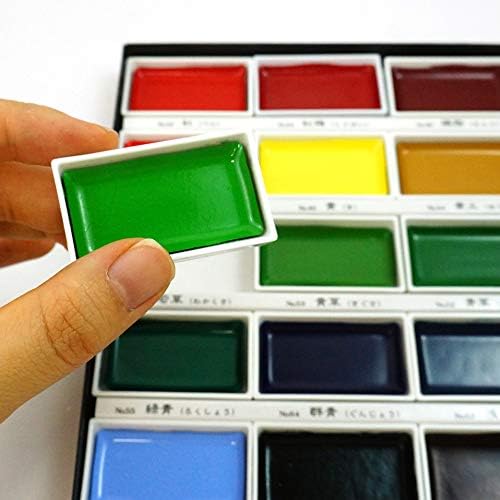
The sets come in configurations ranging from 12 to 96 colors, with a wide range of metallic, iridescent, and muted earth tones that are genuinely difficult to find in Western watercolor lines. The pans are large — noticeably bigger than standard half-pans — which means more paint per color and easier brush loading. Practitioners who use this line consistently describe the paint as highly saturated, fast-releasing, and well-suited to broad washes.
The tradeoffs are real, however. Kuretake does not publish full pigment codes for every color in the Gansai Tambi line, which is a legitimate concern for anyone doing lightfastness-conscious work. Jane Blundell, a pigment researcher and watercolor blogger cited widely in the professional watercolor community for her single-pigment comparisons and transparency notes, has noted in her published color reviews that some Gansai Tambi colors are proprietary blends without disclosed formulas. That is not unusual for craft-oriented paint lines, but it means you are trusting the brand rather than verifying the pigment yourself.
The Gansai Tambi line occupies an interesting middle tier: higher craft quality than most student sets, but not archival-professional in the Western ASTM-documented sense. For illustrators, journalers, and painters working primarily for digital reproduction — where the physical piece is not the final archival product — this is largely a non-issue.
Cost-per-color snapshot (approximate 2026 street pricing):
| Set | Pan count | Approx. retail | Cost per color |
|---|---|---|---|
| Gansai Tambi 12 | 12 | ~$18–22 | ~$1.50–1.83 |
| Gansai Tambi 36 | 36 | ~$38–45 | ~$1.06–1.25 |
| Gansai Tambi 48 | 48 | ~$48–58 | ~$1.00–1.21 |
That cost-per-color is hard to beat for the pigment density and range delivered. For painters who want a broad, expressive palette — especially one with unique shimmer and muted tones unavailable in Western lines — the 36 or 48 is a considered purchase, not a compromise.
Prima
$29.95
In stock on Amazon
Check price on AmazonPrima Marketing Confections: Beautiful Object, Honest Limits
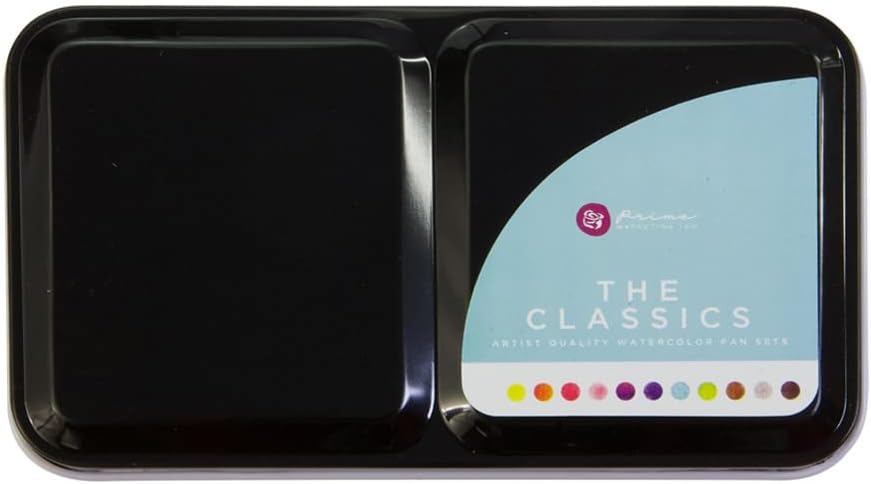
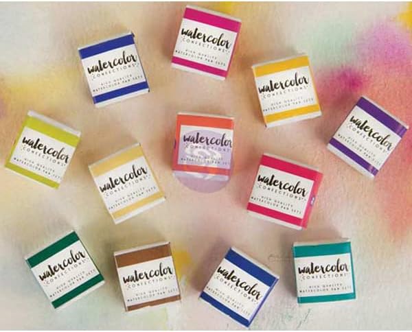
Prima Marketing is a mixed-media and scrapbooking brand that produces the Confections watercolor sets — small, round pan cakes arranged in elegant tins with names like “Tropics,” “Vintage Pastels,” and “Dusk.” They photograph beautifully. They are a perennial gift recommendation. And they are worth understanding clearly before purchasing for studio use.
The Confections sets typically include 12 colors per tin in thematic color stories. The pans are smaller than standard half-pans. Pigment codes are not published. ASTM lightfastness ratings are not disclosed. Artists Network, in its published article “Understanding Watercolor Pan vs. Tube Paints,” identifies tinting strength — the ability of a paint to strongly influence other colors in a mix — as one of the key benchmarks distinguishing craft-grade from professional-grade pan paints. By that measure, the Confections line sits firmly in the lighter, more atmospheric category: gentle washes and soft layering rather than pigment-dense mixing.
Where Prima Confections genuinely shines is in accessibility and experience design. If you are doing light journaling, casual mixed-media work, calligraphy washes, or you want to introduce a beginner to the pan format in an approachable way, Confections deliver a pleasant, low-pressure experience. The packaging is excellent, the color themes are thoughtfully curated, and sets retail in the $15–$25 range.
For anyone reading this with a Daniel Smith tube on their desk or an Arches block on their easel, Prima Confections is a supplementary purchase — suitable for travel or casual sketching — not a primary palette. The absence of pigment transparency, both literally and figuratively, is disqualifying for archival or professional intent. This is not a criticism of the product; it is a category clarification. As Handprint.com notes in its “Watercolor Pigments and Paints” overview, the ability to cross-reference disclosed pigment codes against established lightfastness data is a baseline expectation for paints used in professional or archival contexts — and Prima Confections does not meet that baseline by design. Prima Confections is a watercolor-adjacent craft paint, not a fine art watercolor in that benchmarked sense.
Art
$23.37
In stock on Amazon
Check price on AmazonDaniel Smith Pan Options: Professional Grade, Pan Format
Daniel Smith is best known for tubes — specifically the Extra Fine Watercolor line, which is the benchmark for single-pigment transparency, granulation behavior, and ASTM lightfastness ratings across hundreds of colors, including unique mineral-based pigments. The brand also offers the paint in dot card format (sample-size dried dots on card stock) and, through select retailers, as individual half-pan fills.
The dot card as a teaching tool. A Daniel Smith Dot Card is a physical sampler that allows painters to audition colors before committing to full tubes. At roughly $15–$25 for a comprehensive card (pricing varies by retailer and configuration), it is one of the most cost-effective ways to build single-pigment knowledge available in the market. Wet the dot with a brush, drag a swatch, and you can observe exactly what PB29 Ultramarine looks like versus PB15 Phthalo Blue on your specific paper. Artists Network, in its published resources on pigment literacy for intermediate painters, specifically recommends color audition tools at this stage of practice development, noting that direct swatch comparison is more reliable than making purchasing decisions from digital color representations alone.
Half-pan fills. Daniel Smith half-pan fills are available through the brand and select art retailers, though the selection is narrower than the full tube line. What you get is the same extra-fine pigment concentration, published pigment codes, and documented ASTM ratings — just in pan format. As Jacksons Art notes in its “Artist-Grade Watercolor Materials” overview, this concentration advantage translates to deeper color payoff once the pan surface is properly opened, making the format practical for painters who want archival-grade performance in a portable kit.
The cost framing. Individual Daniel Smith half-pan fills typically retail at $8–$15 per pan depending on the pigment series. That is a significant jump from the per-color cost of the Gansai Tambi 48. But the comparison is not equivalent — you are paying for disclosed single-pigment formulas, documented lightfastness, and professional archival grade. For painters who sell original work, exhibit, or plan to archive pieces long-term, the premium reflects genuine material differences, not brand positioning alone.
Kuretake
$59.98
In stock on Amazon
Check price on AmazonThe Decision Matrix: If X, Then Y
The “best” set depends entirely on what you are optimizing for. Here is the practitioner framework built from the variables examined above.
If you want the broadest palette at the lowest cost-per-color, with genuine pigment saturation and a unique color range — especially shimmer and earthy Japanese tones — and you are not selling physical originals requiring ASTM documentation: Kuretake Gansai Tambi 36 or 48. This is the workhorse portable palette for illustrators, journalers, and painters who work digitally or create primarily for personal use. The larger pan size is a genuine ergonomic advantage over most Western half-pan alternatives, allowing more brush loading per stroke before returning to the palette.
If you want to gift a set to someone beginning their watercolor journey, or need a lightweight travel kit for casual sketching with no professional pressure: Prima Confections is a reasonable choice in the under-$25 range. Know what it is — a curated craft experience with atmospheric color stories — and it delivers on that promise reliably. Do not expect it to compete with pigment-coded paints.
If you are an intermediate or advanced painter building a palette with archival intent, tracking lightfastness, learning single-pigment behavior for clean mixing, or you sell original work: Daniel Smith, starting with the dot card to audition colors before committing to full tubes or pan fills. The dot card is one of the best value investments in watercolor education at its price point, as noted above.
If you already have a Daniel Smith tube practice and want a travel pan version of your existing palette: Daniel Smith half-pan fills, purchased selectively to mirror your tube colors, is the most consistent approach — same pigment, same behavior, just dried into a portable format.
What Pan Sets Can’t Do
Artists Network, in its published coverage of pan-versus-tube watercolor dynamics under “Understanding Watercolor Pan vs. Tube Paints,” makes a point worth repeating here: pans are format-optimized for portability and convenience, not for large studio washes or heavy pigment loading on oversized paper. If your practice involves full-sheet Arches blocks and wide flat washes, tubes remain more practical regardless of which pan brand you choose. The pan decision is fundamentally a mobility and curation decision, not a quality substitute for a tube palette.
The Kuretake Gansai Tambi partially addresses this constraint through its larger-than-average pan size, which allows more brush loading than standard Western half-pans — a real and practical advantage for painters who want to push pan format further than it typically allows.
Final Take
For most intermediate practitioners building a portable specialty palette that earns its space in a bag: Kuretake Gansai Tambi 36 is the honest front-line recommendation. The color range, pan size, and cost-per-color math are difficult to argue with for non-archival work. Pair it with a Daniel Smith dot card to deepen single-pigment literacy without committing to full tubes — that combination covers substantial ground for under $75 combined, and the two tools serve genuinely different and complementary functions.
Prima Confections is a lovely object. Understand its category before reaching for it in a professional context, and it will not disappoint within that category. All three sets have a legitimate place in a painter’s toolkit; the failure mode is using a craft paint where professional archival standards are required, or overspending on professional-grade pans when the work will never leave a sketchbook.
How the Tiers Compare
For readers weighing price against capability, here’s how the standout picks break down by budget level.
Best Budget Pick
At $23.37, this is the value option in this lineup — it covers the essentials without the premium-tier cost, the smart starting point if you’re weighing price against capability.
Art
$23.37
In stock on Amazon
Check price on AmazonBest Mid-Range Pick
At $30.95, this is the balanced choice — it closes most of the gap to the high end while staying well short of premium pricing, which is why it’s the pick most buyers actually land on.
Prima
$29.95
In stock on Amazon
Check price on AmazonBest Premium Pick
At $59.98, this is the top performer here — you pay for it, but if capability and longevity matter more than the upfront cost, this is the one to beat.
Kuretake
$59.98
In stock on Amazon
Check price on Amazon