Watercolor sets are usually sold as generic starter assortments — twelve or twenty-four colors selected to cover the spectrum broadly, leaving you to figure out which ones work together for your actual subject matter. A specialty set flips that logic: instead of buying a general palette and spending sessions learning which mixes turn muddy, you get a collection pre-selected around a specific subject — portraits, botanical illustration, tropical florals — where most of the chromatic homework has already been done by the formulator. For an intermediate painter with a real subject focus, that’s not laziness. That’s a genuine head start. This guide breaks down the most talked-about specialty sets in three subject categories, names the trade-offs honestly, and gives you a clear decision framework so you buy the one that actually fits your workflow.
| EDITOR'S PICKROSA Gallery Botanical Watercol… | Mid-tierPrima Marketing 584252 Watercol… | Budget pickArt Philosophy Watercolor Confe… | |
|---|---|---|---|
| Piece count | 28 | — | — |
| Palette format | Metal box | — | — |
| Subject | Botanical | Classics | Tropicals |
| Lightfastness | High | — | — |
| Washable | ✓ | — | — |
| Price | $46.99 | $29.95 | $23.37 |
| See on Amazon → | See on Amazon → | See on Amazon → |
What “Specialty” Really Means — and What It Doesn’t Guarantee
“Specialty” is a marketing label, not a quality certification. It means the manufacturer (or a third-party curator) has selected colors around a theme. What it does not mean: the paints are automatically single-pigment, lightfast, or professional grade. Those qualities depend entirely on which brand and line the set draws from.
Before we go set by set, two concepts worth locking in:
Single-pigment vs. multi-pigment paints. A single-pigment paint (e.g., a tube labeled PB29, which is Ultramarine Blue) contains one colorant. When you mix two single-pigment paints, you get cleaner, more predictable results. A multi-pigment paint blends several colorants inside the tube to hit a target hue — convenient, but muddier in mixes. As Handprint.com’s pigment review database makes clear, the transparency and granulation behavior you actually see on paper is determined by the specific pigments involved, not the color name on the label.
Transparency vs. opacity. Transparent watercolor allows the white of the paper to glow through the paint layer. Opaque watercolor (or gouache) covers the paper surface. Most watercolor sets advertise transparency as a virtue — but some pigments used in specialty palettes, particularly the soft pastel tones, require white pigment (typically PW6, titanium white) to achieve those muted values, which makes those specific pans technically semi-opaque. This distinction matters enormously for layering and lifting work, and it’s one of the most commonly missed details in specialty set purchases. More on this in the FAQ.
Botanical Sets: Precision, Staining, and the Lifting Question
Botanical illustration (painting plants with scientific or decorative accuracy) has specific technical demands: you need strong, slightly staining pigments that hold fine detail, reasonable lifting ability for corrections, and a palette weighted toward yellow-greens, warm earths, and cool blues rather than the jewel-tone assortment most general sets favor.
Rosa Gallery Botanical Watercolor Set is the set that keeps appearing in the conversation for this subject. Reviewers who came to it from student-grade paints consistently describe it using the phrase “almost professional grade” — high enough pigment concentration that the colors read as rich and saturated even in thin washes, but the staining behavior is notably less aggressive than they expected given the pigment density. That’s a meaningful detail for botanical work, where you regularly need to lift a wet wash to soften an edge or recover a highlight. According to aggregated buyer reviews across multiple retail platforms, users report good lifting performance while the paint is still wet, with staining only becoming a real issue on re-wet dry layers — which is normal and manageable behavior.
The color selection in the Rosa Gallery Botanical set skews exactly right for the subject: multiple greens across the yellow-to-blue axis, warm and cool earth tones for stems and bark, a usable violet and a warm pink for flower work. What it lacks is the deep, saturated phthalo-range blue you’d want for deep-shadow work on dark foliage — a gap easily filled with a single additional tube.
Is it suitable for actual botanical illustration work? For decorative botanical painting — greeting cards, journals, art prints — yes, without reservation. For scientific botanical illustration (where archival permanence and precise color accuracy for publication are requirements), you’d want to verify individual pigment lightfastness ratings before committing to finished work. Artists Network’s guidance on lightfastness ratings recommends looking for ASTM I or II ratings for any work intended for sale or exhibition.
The cost math:
| Set | Pan count | Approx. price range | Per-pan cost |
|---|---|---|---|
| Rosa Gallery Botanical | 12 half-pans | $25–$35 | ~$2.50–$2.90 |
| Building equivalent from Daniel Smith tubes | 12 colors | $90–$140 | ~$7.50–$11.00 |
The per-pan differential is real. The caveat is pigment quality and load — the Rosa Gallery pans won’t perform identically to Daniel Smith Extra Fine half-pans. But for a working palette you’re learning from and adjusting over time, the entry cost is genuinely reasonable.
Skin Tone Sets: The Ergonomics Are Part of the Product
Portrait and figure work in watercolor is notoriously unforgiving. Skin tones mix from a surprisingly narrow range of pigments — warm yellows, transparent reds, earth tones, and a cool shadow color — but getting those mixes right requires practice, and having the wrong starting colors costs you time and frustration.
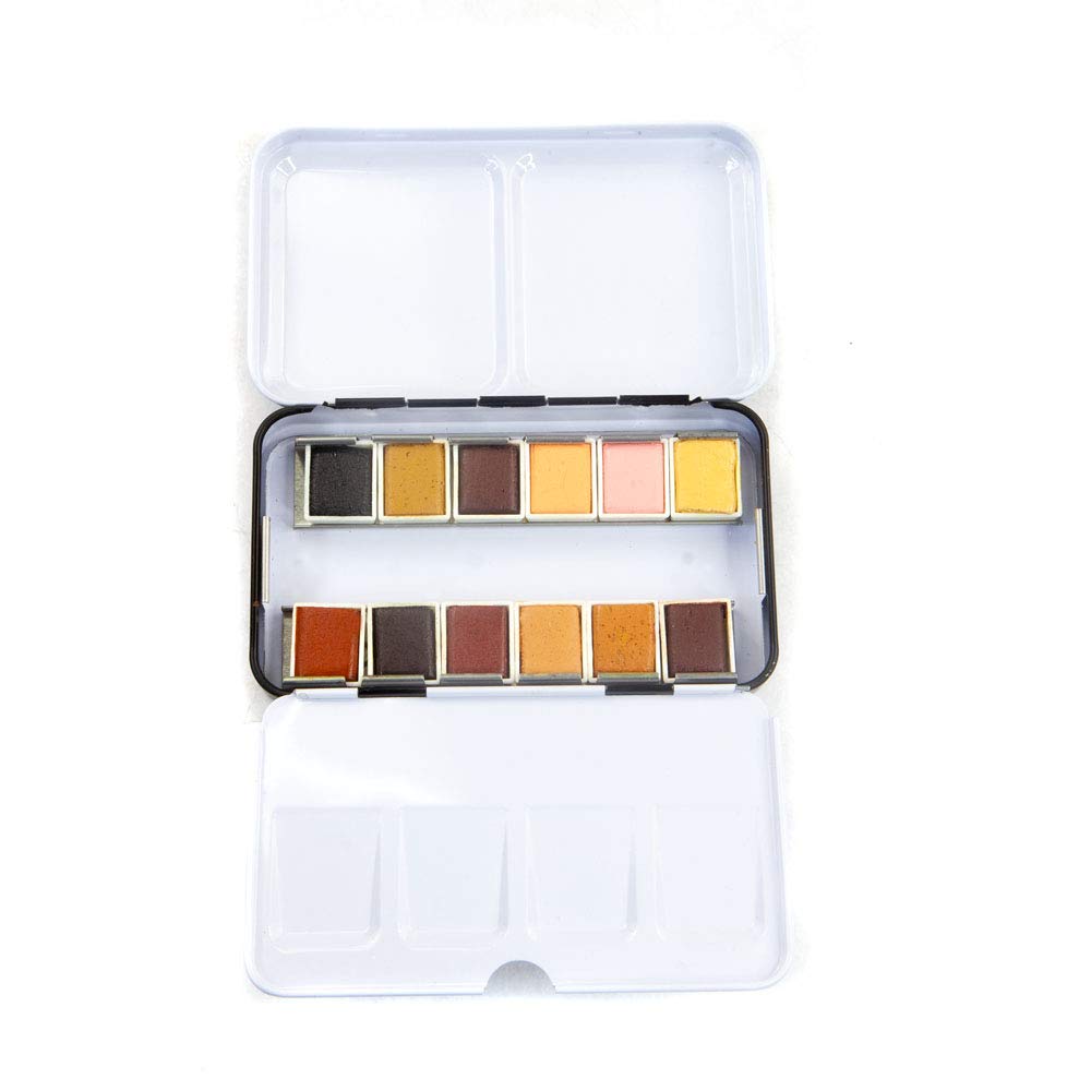
Prima Marketing Complexion Watercolor Set is the most discussed specialty skin-tone set in this price tier, and it has two details that reviewers specifically flag as underappreciated in the product listing:
First, the tin has a ring on the bottom designed for handheld use — you can slip two or three fingers through it and hold the palette flat while you paint figure studies, rather than hunting for a surface to set it on. For life drawing sessions and portrait painting, this is a genuine ergonomic feature, not a gimmick.
Second, the removable tray turns the lid into a mixing surface. Lift the pan tray out, flip the lid open, and you have a clean white area for mixing. This is more practical than it sounds when you’re working from a reference and don’t want a separate ceramic palette taking up easel space.
Beyond the hardware: how do the colors compare to building your own skin-tone palette from scratch? Reviewers consistently say the Complexion set covers the warm-to-cool range you need for fair to medium skin tones, with particular praise for the muted rose and peachy-warm tones that are genuinely hard to hit cleanly with multi-pigment mixes. The limitation is coverage for deeper skin tones — the deeper brown and warm neutral pans require more mixing and layering to reach the values needed for richly saturated portrait work. If your subjects regularly include deeper complexions, plan to supplement.
The set also accepts additional half-pans if you want to expand it, which several reviewers note as a meaningful point in its favor — the tin isn’t a closed system.
Tropical and Floral Palettes: Low Intimidation, Lasting Value
A different set of buyers comes to subject-specific palettes: people returning to watercolor after a gap, or painters who are past the beginner stage technically but want a confidence reset with a visually coherent starting point.
Prima Marketing Tropicals Watercolor Set surfaces repeatedly in this context. Reviewers who describe themselves as returning to watercolor after long breaks use specific language: “low-intimidation,” “immediately impressive results,” and “actually makes me want to sit down and paint.” That’s worth taking seriously. A palette where the colors already work together visually — the saturated teals, warm corals, and acid yellows of a tropical palette are inherently harmonious — reduces one layer of decision-making while you’re rebuilding technique.
The honest assessment: the Tropicals palette isn’t positioned as a professional archival set. The pigment selection prioritizes visual vibrancy over single-pigment purity. For practice work, illustration for print, and decorative painting, that’s a completely reasonable trade-off. For work intended for sale or long-term display, checking individual pigment lightfastness becomes more important.
Prima Marketing Pastel Dreams Set occupies a related but distinct niche — the soft, muted palette popular in journaling and mixed-media work. And this is the set with the transparency issue that needs to be addressed plainly: those muted pastel values require white pigment mixed into the formulation. Jackson’s Art Blog’s guide to watercolour transparency explains this clearly — any paint that uses white pigment to shift a hue toward pastel is, by definition, reducing transparency. The result behaves more like a soft gouache than a standard transparent watercolor.
This isn’t a defect — it’s physics. But buyers who expect the Pastel Dreams pans to layer and lift the way transparent watercolor does will be confused by the results. The practical fix several experienced reviewers recommend: keep a tube of white gouache nearby to use intentionally for opaque highlights and layering, rather than fighting the pastel pans’ natural opacity.
Frequently Asked Questions
Are Prima Confections pastel colors transparent or opaque? Technically semi-opaque. The soft, muted pastel values require white pigment in the formulation — and as Handprint.com’s pigment database and Jackson’s transparency guides both make clear, white pigment reduces transparency. These pans will behave more like light-value gouache than transparent watercolor in layering and lifting applications. That’s not wrong, it’s just different — plan your technique accordingly.
Can I add extra half-pans to the Prima Complexion tin? Yes. Multiple reviewers confirm the tin accepts standard half-pans. The removable tray design makes rearranging and supplementing the set straightforward.
Is the Rosa Gallery Botanical set suitable for actual botanical illustration work? For decorative botanical painting, yes. For scientific illustration intended for archival publication or sale, verify the ASTM lightfastness rating of individual pigments before committing to finished work — not all pans in value-tier sets carry ASTM I ratings.
How do Prima Complexion colors compare to mixing skin tones from a standard palette? The pre-selected muted roses and peachy warm tones are notably harder to hit cleanly from a general palette’s primaries. For fair to medium skin tones, reviewers find the set saves significant mixing time. For deeper skin tones, supplementation is needed. Mixing from scratch gives you more control; the Complexion set gives you faster access to the middle tones most portrait painters use most often.
Do specialty watercolor sets work for beginners, or do you need technique first? The sets themselves work at any level. The caveat is expectation-setting: specialty sets skip color mixing homework, not brushwork technique. A beginner using the Complexion set will still need to learn wet-on-wet versus wet-on-dry handling, value control, and edge work. The palette just removes one variable.
How long do the pans last with regular use? This varies by paint load and painting frequency, but as a general reference point, Artwork Archive’s art supply guidance notes that half-pans from a standard set typically last a hobbyist painter six months to over a year of regular use. Heavy-use painters exhaust specific pans faster — another reason to confirm that your tin accepts replacement half-pans before buying.
The Decision Rule
If your primary subject is botanical or floral work and you want a palette that requires minimal supplementation: the Rosa Gallery Botanical Set is the practical starting point, with a single tube of a deep phthalo blue added for shadow work.
If you’re focused on portrait and figure painting and want ergonomic advantage plus a warm-skin-tone foundation: the Prima Complexion set’s ring-bottom tin and expanding tray design make it a working tool, not just a kit. Supplement for deeper skin tones.
If you’re rebuilding a watercolor practice after a break and want visual confidence fast: the Prima Tropicals palette’s inherent color harmony reduces friction while you’re getting your eye back. It sustains serious use well beyond the re-entry phase.
If pastel or muted-tone aesthetics are central to your work: go in with eyes open about the opacity trade-off in Prima Pastel Dreams, keep white gouache on hand, and use the opacity deliberately rather than fighting it.
The best specialty set is the one matched to your actual subject — not the most impressive label or the longest color count. Buy for the work you’re making right now.