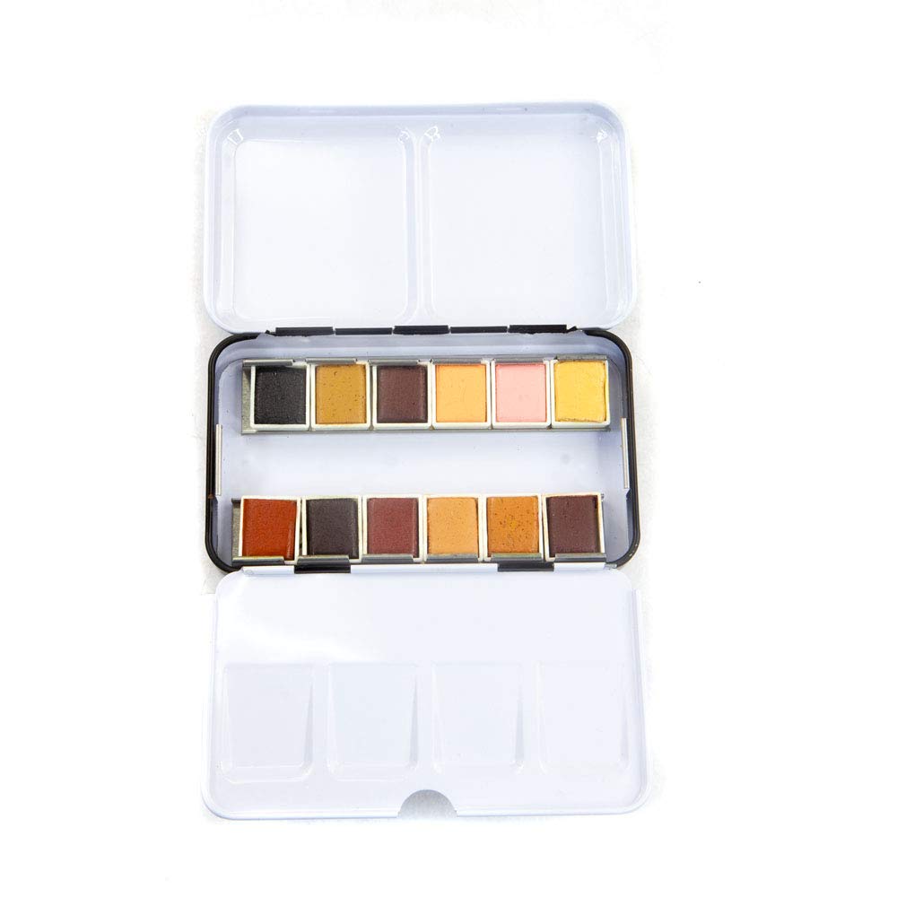
If you’ve been painting for a year or two, you’ve probably noticed that a general-purpose watercolor set — one of those 12- or 24-pan starter kits — gets you started but starts feeling limiting the moment you have a specific subject in mind. Skin tones look muddy. Botanical greens feel flat. Florals go chalky. That’s not a skill problem; it’s a materials problem. A specialty palette is a curated set of paints built around the color relationships a particular subject actually demands — fewer paints, but the right paints, pre-selected for how they interact. This article walks through three subject categories — portraits and skin tones, botanical illustration, and loose florals — names the sets that reviewers consistently single out in each category, and explains the trade-offs so you can decide whether a specialty set belongs in your studio or whether you’re better off hand-picking individual tubes.
Why Subject-Specific Palettes Exist (and When They’re Worth It)
A general 12-color palette is designed to cover the widest possible range of subjects with the smallest number of pans. That’s a reasonable design goal for a beginner. But once you’re working with intention — committing to portraiture, illustrating scientific specimens, or developing a floral style — that generalist spread starts fighting you. You end up reaching for the same two or three colors constantly and ignoring the rest.
Specialty sets flip the logic. They narrow the range deliberately so that every color in the set participates in the subject. A skin-tone palette leans heavily into muted earth tones, soft pinks, and neutralizing complements. A botanical palette prioritizes a wide value range within greens and the specific yellow-greens that appear in living plant tissue. A floral palette favors clean, transparent pigments that layer without muddying.
The trade-off is real: you gain harmony and subject accuracy, but you give up versatility. A skin-tone set is not a landscape set. If you paint multiple subjects, you may end up owning two or three targeted palettes rather than one master set — and that’s a legitimate studio strategy, not a marketing trick.
By the numbers:
- A curated 10–12 color specialty set typically runs $25–$85, depending on grade
- A comparable selection of individual Daniel Smith tubes to replicate that range runs $90–$180+
- Specialty sets from recognized brands (Daniel Smith, Prima, Schmincke) often include at least one color not available in standard sets
Skin Tones: The Prima Complexion Set and the Portrait Palette Problem
Portrait work is where generic palettes fail hardest. Skin is not pink. It’s a layered mix of warm undertones, cool shadows, and neutrals that shift dramatically across light sources and complexions. The pigments you need — soft peaches, muted pinks, warm ochres, and cool lavenders for shadow work — rarely all appear in the same general set.
The Prima Marketing Complexion Watercolor Set is one of the most frequently mentioned options in this space. Reviewers on aggregated retail platforms consistently describe it as “actually useful for skin tone mixing,” which sounds like a low bar until you realize how many portrait-marketed sets miss that mark by including oversaturated pinks that can’t be neutralized. One detail reviewers keep returning to: the metal tin it ships in doubles as a travel palette, and it has room to add a few half-pans of your own — meaning you can supplement it with, say, a Daniel Smith Quinacridone Burnt Scarlet (PO48) or a Burnt Sienna (PR101) to expand the warm shadow range without buying a whole new set.
Per Artists Network’s guidance on mixing skin tones in watercolor, the foundational logic is that realistic skin requires value control more than hue variety — the ability to push a color light without it going chalky, and dark without it going muddy. That points toward transparent, single-pigment choices wherever possible, and it’s the right frame for evaluating any skin-tone set.
The honest caveat: Reviewers who go deeper on the Prima Complexion set note it works well as a starting point for skin tones but that painters doing serious portraiture across a wide range of complexions — particularly deeper skin tones — will want to add a few supplemental colors. The set skews toward lighter warm undertones out of the box. That’s not a dealbreaker; it’s a customization signal. The metal tin with expansion room is the set’s quiet strength.
Botanical Illustration: ROSA Gallery and the Rich Green Gold Warning
Botanical watercolor has a specific technical demand that most general palettes aren’t built for: color accuracy under magnification, across a wide range of greens, with predictable wet-to-dry behavior. If you’re painting plant specimens with any illustration intent — even casual naturalistic work — you need greens that don’t shift dramatically as they dry, and you need enough variation in the green-yellow-ochre range to capture the difference between a new leaf and a senescent one.
The ROSA Gallery Botanical Watercolor Set has become a quiet favorite in this space. Reviewers repeatedly use language like “almost professional grade” and “I wish I’d bought this first” — which, as Fine Art Tips’ coverage of botanical watercolor notes, is the signal that a set is punching above its price tier. ROSA Gallery is a Ukrainian brand with artist-grade aspirations at closer to student-grade pricing; the pigment selection in the botanical set is genuinely thoughtful for the subject, with a range of greens and earth tones that hang together well.
One critical caveat that reviewers flag consistently: Rich Green Gold. This color — included in several botanical-adjacent sets and popular as a single tube — has a notable wet-to-dry shift. Reviewers describe laying down a rich, warm yellow-green and watching it dry significantly cooler and more muted. Per Handprint.com’s detailed coverage of watercolor pigment behavior, some pigments in the green-gold range undergo meaningful value and chroma shifts as water evaporates, particularly those with complex multi-pigment formulations. For loose florals and impressionistic work, that shift is often a feature — it creates depth. For botanical illustration where you’re trying to match a living specimen, it’s a problem. The practical fix is to test swatches dry before committing to a finished piece, and to mix slightly warmer than you think you need.
If botanical illustration is your primary subject: The ROSA Gallery set is worth serious consideration as a foundation, especially if you’re coming from a student-grade starting point. For practitioners who need guaranteed lightfastness on archival work — scientific illustration, pieces intended for sale — the next step up is building a custom palette around single-pigment Daniel Smith or Schmincke Horadam greens, where pigment codes (PG17, PG36, PY150) and lightfastness ratings are fully documented.
Florals and Fall Subjects: The Jean Haines and Prafull Sawant Daniel Smith Sets
Daniel Smith’s Master Artist Watercolor Sets are co-developed with named painters, which means each set reflects a specific working artist’s actual color choices rather than a committee’s guess at what a subject needs. Two sets are worth discussing here: the Jean Haines Atmospheric World set and the Prafull Sawant Monsoon Colors set.
Jean Haines’ set is built around granulating colors — paints that separate and bloom in wet-in-wet work, creating texture and atmosphere without manual brushwork. Reviewers specifically call out Moonglow and Lunar Blue as the standout colors in the set. Both deserve a technical note: Moonglow (a multi-pigment mix of PB29, PV19, and PBk11) is a granulating dark that shifts between blue, violet, and near-black depending on water ratio and paper texture, making it uniquely useful for atmospheric shadows. Lunar Blue (PB29 with granulating medium incorporated) produces a heavy, sedimentary granulation that pools into visible texture — an effect that can’t be replicated with standard ultramarine. Per Jackson’s Art Blog’s overview of the Daniel Smith range, the Lunar and Moonglow series are among the brand’s most distinctive offerings precisely because they don’t behave like standard pigments. These are not beginner colors; they reward a painter who already understands wet-in-wet timing.
The Prafull Sawant set serves a different mode. Sawant’s palette is built around warm, harmonized earth tones, ochres, and rich naturals that reviewers describe as “color harmony for fall and florals” — a set where everything works together without forcing neutralization. If your floral work tends toward loose, expressive painting rather than structured illustration, and your subject palette runs warm (marigolds, dahlias, autumn botanicals), this set’s pre-harmonized range is a genuine efficiency gain.
Decision frame: Jean Haines if you’re developing an atmospheric, wet-in-wet style and want to explore granulation behavior as part of your vocabulary. Prafull Sawant if you paint warm-toned subjects and want a palette where the colors cooperate without constant neutralization. They’re not competing — they serve different intentions.
How to Know Which Daniel Smith Master Set Matches Your Subject
The Daniel Smith Master Artist sets each carry the named painter’s subject orientation, but the set names don’t always telegraph that clearly. The practical filter: look at the color list, not just the name. A set weighted toward earth tones and warm neutrals is a warm-subject set. A set with granulating colors and atmospheric darks is built for loose, wet work. A set with a wide value range in a narrow hue family (multiple greens at different temperatures) is for subject-specific illustration.
If a set’s color list reads like your current wish-list of individual tubes, it’s worth the price as a bundle. If fewer than half the colors match your subject, buy the individual tubes instead — the bundle economics only work when you’ll use the full set.
Frequently Asked Questions
Is the Prima Complexion set enough to paint realistic portraits, or do I need additional colors? Reviewers describe it as a strong starting point, particularly for lighter warm complexions, but note that serious portraiture across a wide skin-tone range benefits from a few supplemental colors — especially for deeper shadows and cool undertones. The metal tin’s expansion room is designed for exactly this kind of customization.
What makes Daniel Smith Jean Haines colors different from a standard DS starter set? The Jean Haines set is built around granulating pigments — paints that physically separate in water to create texture. Colors like Moonglow and Lunar Blue aren’t in standard starter sets because their behavior is too variable for general learning. They reward painters who already understand wet-in-wet timing.
Why does Rich Green Gold look so different when it dries? Reviewers consistently flag a significant wet-to-dry shift: the color lays down warm and rich, then dries cooler and more muted. This is a known behavior in some complex green-gold pigment formulations, as documented in Handprint.com’s pigment reference materials. For botanical illustration requiring color accuracy, always test dry swatches before using it on finished work.
Is ROSA Gallery a student grade or artist grade watercolor set? ROSA Gallery occupies an interesting middle position. Reviewers describe it as “almost professional grade” — better pigment selection and performance than typical student sets, at a price point below established artist-grade brands. For hobbyists and developing practitioners doing botanical work, it represents strong value. For archival or scientific illustration, confirm lightfastness ratings for individual colors before committing.
How do I know which Daniel Smith Master Artist set matches my subject matter? Look at the color list rather than the set name. Count how many colors match your current working palette or subject needs. If most of the set is relevant, the bundle makes economic sense. If fewer than half the colors apply to your work, individual tubes are the better buy.
Can I mix skin tones from a general watercolor palette without a specialty set? Yes — per Artists Network’s guidance on skin tone mixing, the core requirement is transparent, single-pigment paints in the warm earth and soft pink range, plus a reliable neutralizer. A general palette with a good Burnt Sienna, Raw Umber, Quinacridone Rose, and French Ultramarine covers the basics. A specialty set earns its place when you want pre-tested harmony and the convenience of having the right colors already together — not because general palettes are incapable.