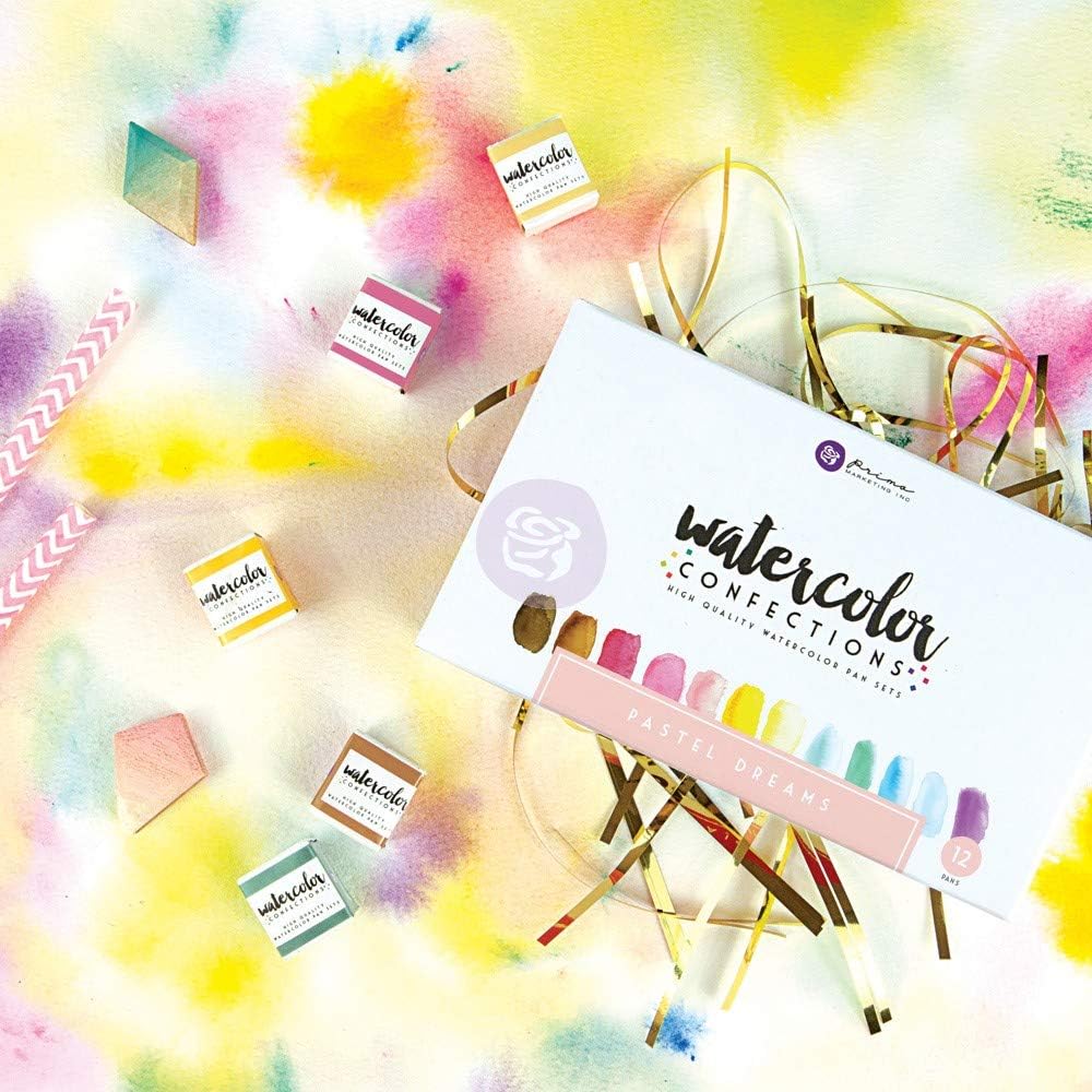
Prima Watercolor Confections: Which Tin Is Actually Worth Buying
Prima Marketing’s Confections watercolor sets — small, hinged metal tins filled with dome-shaped pucks of color — have become a fixture in hobby painting, journaling, and travel-sketchbook circles. If you’re new to the format: these are pan watercolors, meaning solid pigment cakes you activate with a wet brush, packaged in a self-contained tin that doubles as a palette lid. They’re compact enough to fit in a jacket pocket and pretty enough to sit on a desk. That combination has made them genuinely popular.
But “popular” and “worth buying” aren’t the same thing. If you’ve moved past starter kits and you’re comparing materials the way an investor compares assets — looking at pigment codes, lightfastness ratings, color redundancy, and how a set complements what you already own — Prima Confections deserve a more honest look than the social-media highlight reel typically offers. This guide cuts through the enthusiasm to tell you which tin actually pulls its weight, which one has a real structural weakness, and what the tradeoffs look like depending on your work.
| EDITOR'S PICKPrima Marketing 584252 Watercol… | Mid-tierPrima Watercolor Confections Wa… | Budget pickArt Philosophy Watercolor Confe… | |
|---|---|---|---|
| Tin size | — | 12 Count | — |
| Color theme | The Classics | Pastel Dreams | Tropicals |
| Pack count | — | 12 | — |
| Price | $29.95 | $27.49 | $23.37 |
| See on Amazon → | See on Amazon → | See on Amazon → |
What Prima Confections Actually Are (And Aren’t)
Prima positions these sets as artist-grade, and the branding leans into the aesthetic — the tins are attractive, the color names are evocative, and the dome-shaped pan format photographs beautifully. But reviewers who bring technical expectations consistently find the line sitting closer to a quality hobbyist product than a professional-grade one.
The core issue, documented repeatedly across buyer reviews aggregated on major retail platforms, is transparency and pigment density. Reviewers who cross-reference these colors against Daniel Smith Extra Fine or Schmincke Horadam consistently describe Prima Confections as more opaque and less luminous in washes — behaviors associated with fillers and lower pigment load. One reviewer cited in multiple roundups explicitly calls The Classics set “closer to student grade in transparency behavior” despite the branding.
That’s not automatically disqualifying. Opacity reads as a flaw if you’re painting luminous glazed washes; it’s a feature if you’re journaling over text, painting illustrative flats, or doing mixed-media work where you want the color to sit on top of a surface rather than sink into it. The question is whether you’re buying for the right job.
On lightfastness — meaning how resistant a pigment is to fading when exposed to light, rated on a scale where I or II is archival — Prima does not publish individual pigment codes or ASTM lightfastness ratings for most of its Confections line. Jackson’s Art Blog’s overview of watercolor lightfastness standards notes that this kind of transparency from manufacturers is a baseline expectation for professional-grade lines, and its absence is a meaningful signal. Handprint.com’s exhaustive pigment reference reinforces why single-pigment transparency and published ratings matter for archival work.
For journaling, practice, and work you’re not selling or exhibiting: the lack of pigment data is a minor inconvenience. For finished work that needs to last decades: it’s a reason to buy Daniel Smith or Schmincke instead and treat Prima as a supplementary travel set.
The Sets, Ranked by Practical Value
The Complexion Set: The Clearest Buy
If there’s one set in the Confections line that reviewers describe as filling a genuine gap rather than replicating what a painter already has, it’s the Complexion set. Buyers across multiple review pools describe it as addressing a real need: a curated range of skin-adjacent tones — warm neutrals, muted pinks, soft ochres, cool tawny shades — that are tedious to mix from a standard palette.
The ring grip design on the Complexion tin — a small loop on the lid that lets you hold the tin like a thumb palette while painting — is called out by multiple buyers as a legitimately useful design detail, not just a novelty. For portrait painters, figure illustrators, or anyone doing character work, the ability to hold the tin in your non-dominant hand while working small is practical in a way that most pan-set packaging isn’t.
Color redundancy, which plagues other sets in the line (more on that below), is lower here because the color brief is narrow and purposeful. You’re not getting five variations of blue — you’re getting a focused warm-to-cool skin tone spread that would take real effort and expense to replicate by mixing from scratch.
The caveat: reviewers who use it for portrait work in a professional context note that they’re supplementing these colors with more lightfast alternatives for final pieces, not relying solely on the Complexion pans. Think of it as your exploratory and thumbnail palette, with archival pigments doing the heavy lifting in finished work.
Best for: Portrait illustrators, figure painters, character designers, mixed-media journalers doing figurative work.
The Classics Set: Competent but Oversold
The Classics is the flagship set and the one most likely to be a first purchase. It covers the expected range — blues, greens, reds, yellows, earth tones, a few neutrals. The problem is that “comprehensive” and “useful” are different things.
Reviewers consistently flag two weaknesses. First, the transparency issue mentioned above: the colors in this set behave more like a quality student-grade paint than a professional line, which means layered glazing produces muddier results than you’d expect from Winsor & Newton Professional or Daniel Smith. Artists Network’s pigment code explainer is a useful frame here — when a manufacturer doesn’t publish what’s inside the pan, you can often infer quality from behavior, and The Classics’ behavior reads as multi-pigment mixes with moderate filler content.
Second, the browns. Multiple reviewers across platforms call the brown and earth-tone selections in The Classics weak for mixing — desaturated in ways that don’t contribute meaningfully to color mixing, and not strong enough to stand alone as rich darks. If you’re relying on earth tones for botanical work, landscape, or any naturalistic palette, this is a real limitation.
Best for: Casual journalers who want a broad starter spread; travelers who want one-tin coverage; buyers who understand they’re getting a hobbyist kit, not a pro set.
Pastel Dreams: The Redundant-Pink Problem
This is the set with the most clearly documented structural flaw. Buyers who open Pastel Dreams and inventory what they actually have consistently report the same thing: a high proportion of the pans are pink or pink-adjacent, creating the visual impression of range that doesn’t survive a closer look.
The pastel palette brief is legitimate — soft lavenders, minty greens, pale yellows, dusty roses — but the execution leans so heavily into pink variations that buyers describe feeling like they’ve paid for the same color three or four times. For mixed-media artists who specifically need a soft, low-saturation palette and have no other pastel options, there’s still a case for this set. For anyone who owns any other set in the Confections line or any standard watercolor palette, the redundancy is immediately noticeable and frustrating.
Best for: Buyers whose entire practice lives in a soft, romantic aesthetic and who need the tin as their only palette. Everyone else should skip it.
By the Numbers
| Set | Best Use Case | Redundancy Risk | Transparency Level | Lightfast Data Published? |
|---|---|---|---|---|
| Complexion | Portrait / figure / character work | Low | Moderate | No |
| The Classics | General journaling / travel coverage | Moderate | Low-moderate | No |
| Pastel Dreams | Soft-palette specialists only | High | Moderate | No |
The Tin-as-Palette Question
One consistently praised feature across all sets is the tin itself as a functional mixing surface. The metal lid — smooth, slightly textured — works as a mixing palette for wet color, and buyers note that this is genuinely useful for small-format work where you don’t want a separate palette taking up table space. This isn’t a selling point that changes the pigment math, but it’s a real quality-of-life detail that reviewers mention independently enough to take seriously.
Jackson’s Art Blog’s comparison of half pans versus tube watercolors is useful context here: pan watercolors in general offer the convenience-versus-pigment-depth tradeoff that Prima Confections exemplifies. The tin format amplifies convenience at some cost to mixing flexibility.
Frequently Asked Questions
Are Prima Confections lightfast enough for finished artwork, or are they best for practice and journaling?
Based on the absence of published pigment codes and ASTM lightfastness ratings from Prima for the Confections line, these sets are not recommended for finished artwork intended to last decades or be sold. The lack of data doesn’t prove the pigments are fugitive, but it removes your ability to verify archival quality — a standard that professional-grade lines like Daniel Smith, Schmincke Horadam, or Winsor & Newton Professional meet explicitly. For practice, sketching, journaling, and any work where longevity isn’t a requirement, the lightfastness gap is less consequential.
Can you refill Prima Confections tins with standard half pans from other brands?
The tin dimensions and pan slots in Prima Confections sets are not standardized to the international half-pan format used by most professional watercolor manufacturers. Reviewers attempting to drop in Winsor & Newton or Daniel Smith half pans report inconsistent fit — some pans sit loosely, others don’t fit without modification to the slot. The tins can work as a housing for loose pans held in place with a small amount of adhesive putty or poster tack, but it’s a workaround rather than a seamless system. If refillable pan organization matters to you, a standard travel palette designed for half pans is a more reliable investment.
How transparent are Prima Confections compared to Daniel Smith or Kuretake Gansai Tambi?
Across aggregated reviews, the pattern is consistent: Prima Confections sit below Daniel Smith in transparency and above Kuretake Gansai Tambi, which is intentionally more opaque and gouache-like by design. Daniel Smith’s single-pigment formulations produce the kind of luminous, glowing wash layers that professional watercolorists rely on for glazing; Prima reads as denser and more matte in comparison. Gansai Tambi is a different tool entirely — vibrant and graphic, designed to sit on top of a surface. Prima occupies a middle position that suits illustrative and journaling applications better than it suits traditional transparent watercolor technique.
Which Prima Confections set has the least color redundancy for someone who only wants to buy one?
The Complexion set has the most purposeful color selection relative to its brief, but it’s only the right answer if your work includes figurative or portrait content. For a single-set buyer who needs general-purpose coverage, The Classics is the default choice despite its limitations — it offers the broadest spread with moderate rather than high redundancy. Pastel Dreams is the set to avoid if you’re buying only one tin and need working range.
Is the Complexion set useful for painters who aren’t specifically doing portrait work?
More than reviewers initially expect, yes. The warm neutrals, muted pinks, and tawny earth tones in the Complexion set are useful for botanicals, architectural studies with warm stone or wood tones, animal fur and feather palettes, and any work that needs desaturated warmth. The ring grip makes it a functional secondary palette for outdoor sketching. Painters who don’t do faces at all still find the set fills a mixing gap that a standard landscape or general palette doesn’t cover.
The Decision Frame
If you’re an intermediate practitioner evaluating whether any Prima Confections tin deserves a place in your kit alongside your existing Daniel Smith or professional-grade paints, here’s the honest if-then:
If you do portrait, figure, or character work and want a curated skin-tone spread in a portable format → The Complexion set is worth buying as a supplementary travel and thumbnail palette.
If you want a single-tin option for journaling, travel, or casual practice where archival quality isn’t the priority → The Classics covers the brief, with clear eyes about its transparency limitations.
If you’re considering Pastel Dreams and you already own any other watercolor set → skip it. The redundancy will frustrate you within the first session.
And if you’re deciding between Prima and a proper professional half-pan travel kit: Prima wins on price and aesthetics; Daniel Smith or Schmincke wins on pigment quality, lightfastness certainty, and mixing depth. They’re solving for different things. The Complexion set is the one case where Prima solves for something specific enough that the comparison is almost unfair — it’s not competing with a Daniel Smith portrait palette because no mainstream manufacturer makes one quite like it.