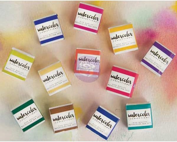
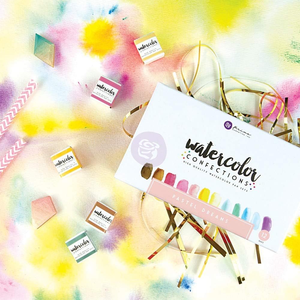
Prima Confections watercolors (made by Prima Marketing) are pre-panned watercolor sets — meaning the paint comes already dried into small, ready-to-use cakes called pans or half-pans, housed in a decorative metal tin. You wet a brush, touch it to a pan, and paint. There’s no tube to uncap, no palette to squeeze colors onto. The brand sits in an interesting middle zone: fancier and more considered than dollar-store craft sets, but priced below the Daniel Smith or Sennelier pan sets that serious watercolorists typically graduate toward. Prima currently offers four distinct tins — Pastel Dreams, Tropicals, Complexion, and The Classics — each built around a themed color story. If you’re trying to figure out which one (or which combination) makes sense for your practice, the answer depends on more than aesthetics. Transparency, pigment quality, portability, and intended subject matter all play a role, and reviewers across skill levels have left enough consistent signal to make a confident call.
| EDITOR'S PICKPrima Marketing 584252 Watercol… | Mid-tierPrima Watercolor Confections Wa… | Budget pickArt Philosophy Watercolor Confe… | |
|---|---|---|---|
| Collection | The Classics | Pastel Dreams | Tropicals |
| Pan Count | — | 12 | — |
| Count | — | 12 | — |
| Color Theme | Classics | Pastel | Tropical |
| Pack Size | — | 12 | — |
| Price | $29.95 | $27.49 | $23.37 |
| See on Amazon → | See on Amazon → | See on Amazon → |
The Four Tins at a Glance
Before getting into each set individually, here’s the honest framing: Prima Confections tins are not all equivalent products wearing different colors. The palettes differ in opacity, pigment density, and apparent quality — and experienced painters have noticed.
By the numbers:
- Typical pan count per tin: 24–36 half-pans depending on configuration
- Price range (as of mid-2026): approximately $25–$45 per tin at most retailers
- Tin format: hinged metal lid, most include a built-in brush or mixing palette
- Complexion tin distinguishing feature: removable pan tray, metal carrying ring
Across aggregated reviews, the pattern is clear: beginners tend to find all four tins impressive and vibrant. Painters with more experience — those who have spent time with artist-grade single-pigment paints — start to see meaningful differences between the sets. That’s not a knock on beginners; it’s just useful calibration for setting your expectations before you buy.
How Each Tin Performs: Detailed Breakdowns
The four Prima Confections tins share a format but differ substantially in transparency, pigment behavior, and intended use case. The sections below treat each tin as its own subject, with a tier marker at the close of each to indicate where it lands in the market relative to the others.
Pastel Dreams: The Opacity Trade-Off You Should Know Going In
The Pastel Dreams tin is the one that generates the most consistent explanatory reviews — and the explanation is always the same. Pastel colors (soft pinks, muted mints, hazy lavenders) don’t occur naturally in transparent watercolor without some intervention. Achieving true pastels in a watercolor pan requires either white pigment mixed in, or titanium white as a component color — both of which reduce transparency, the quality that makes watercolor look luminous rather than chalky.
Reviewers who know their watercolor theory flag this immediately: the Pastel Dreams pans are noticeably more opaque than the other tins. One owner explicitly described this as an intentional convenience trade-off, not a manufacturing defect — and that’s the right framing. If you want soft, dusty tones without mixing white into every puddle yourself, these pans do that work for you. If you’re expecting airy, light-filled washes that glow off white paper, you’ll be working against the paint’s nature.
Handprint’s long-running resource on evaluating watercolor paints — titled “Evaluating Watercolor Paints,” available at handprint.com — identifies opacity as one of the most important attributes to understand before purchasing any pan set, because it fundamentally changes how you build layers and achieve luminosity. The Pastel Dreams tin makes a specific stylistic choice — pre-mixed opacity — and it’s worth knowing that going in.
Who should buy Pastel Dreams: Illustrators and lettering artists who want ready-to-use soft colors for greeting cards, journaling, or mixed-media work where a gouache-like softness is welcome. Not the right set if transparent glazing is central to your technique.
Art
$23.37
In stock on Amazon
Check price on AmazonTropicals: The Repeat-Purchase Tin
Among the four, Tropicals generates the most enthusiastic long-term loyalty. Reviewers don’t just recommend it — multiple owners report buying a second set after years of use, which is a meaningful signal in a product category where buyers have near-infinite alternatives.
The appeal is fairly straightforward: the color story (saturated turquoises, warm corals, bright magentas, tropical greens) happens to map onto a wide range of painting subjects beyond the obvious botanical and beach work. Floral painters, surface pattern designers, and mixed-media artists all show up in the reviewer base. The colors are vivid without tipping into garish, and they play well with each other on the palette — which isn’t guaranteed in a themed set.
Transparency in the Tropicals set runs higher than in the Pastel Dreams tin, which makes the colors more useful for traditional watercolor layering. Reviewers consistently describe the pigments as strong enough to produce deep washes without becoming muddy, though — as with any set at this price point — single-pigment purity is not the standard. Artists Network’s guide to selecting watercolor paints, “How to Choose Watercolor Paints” at artistsnetwork.com, notes that multi-pigment formulas are common at the student and semi-professional tier, and while they can produce lovely results, they’re more prone to muddying when mixed together than their single-pigment counterparts.
Who should buy Tropicals: The broadest-use tin in the line for intermediate painters. Florals, botanicals, pattern work, and anything that benefits from high-chroma warm and cool hues. Also worth considering as a complement to a more muted professional palette when you need accent color without buying individual tubes.
Prima
$27.49
In stock on Amazon
Check price on AmazonComplexion: The Portrait Painter’s Tin
The Complexion tin earns its own section not just because of its color story — warm neutrals, peachy mids, rich browns, deep siennas — but because of its physical design. The tin includes a built-in metal ring for holding the case while you paint, a feature that portrait and figure painters who work standing at an easel or plein air will immediately appreciate. The pan tray is also removable, with room underneath for additional half-pans — meaning you can expand the palette with colors from other sets or individual pans as your portrait practice evolves.
Multiple reviewers specifically call out this portability and form factor. For figure work — whether you’re in a life drawing session, painting outdoors at a figure workshop, or building a portrait practice from reference — being able to hold the tin with one hand and paint with the other is a genuine ergonomic advantage over flat palette-style sets.
The color range is calibrated toward human skin tones across a range of values and temperatures, which makes it functionally different from the other three tins rather than just aesthetically different. Experienced portrait painters note that you’ll still need to supplement with a strong blue or violet for shadows, and a reliable yellow for warmer complexions — but as a dedicated starting palette for figure work, the Complexion tin covers more ground than a general-purpose set would.
Who should buy Complexion: Portrait painters, figure artists, and anyone building a dedicated flesh-tone palette. The form factor alone is worth the price premium for painters who work in non-studio settings.
Prima
$27.49
In stock on Amazon
Check price on AmazonThe Classics: The One with the Asterisk
The Classics tin is the broadest palette in the line — a general-purpose set of foundational hues — and it’s also the one that experienced painters assess most critically. The consistent note from reviewers with a technical frame of reference is that The Classics “skew more student grade” compared to the other tins in the Prima line. That’s a relative judgment, but it’s coming from painters who’ve used the full range side by side, and it’s worth taking seriously.
There’s also a pricing quirk that appears specifically in Classics reviews: owners note that the price for additional or replacement sets has shifted unpredictably across purchase occasions. This kind of price instability is worth flagging for anyone who buys multiples or sources for a classroom, because the cost basis for restocking is genuinely uncertain.
Fine Art Tips’ breakdown of watercolor paint grades — “Watercolor Paint Grades Explained,” at finearttips.com — describes student-grade formulas as typically using less pigment per unit volume and being more likely to rely on hue substitutes: synthetic alternatives to more expensive single-pigment paints. This doesn’t make them worthless. For practice work, journaling, and exploration, a student-grade formula is entirely serviceable. But for work you intend to display, sell, or preserve long-term, it matters.
Who should buy The Classics: Beginners building a first palette or painters who want a general-purpose set for sketchbooks and study work. Intermediate practitioners building a considered studio practice will likely outgrow this set faster than the others.
Art
$23.37
In stock on Amazon
Check price on AmazonDo the Tropicals and Complexion Tins Work Together?
Yes — and this is one of the more useful practical questions to answer. The Tropicals set is heavily weighted toward high-chroma warm and cool hues with minimal overlap in the neutral and flesh-tone territory that Complexion covers. Used together, they form a complementary system: Complexion handles the figure, Tropicals handles saturated backgrounds, botanicals, and accent colors. Reviewers who have used both describe minimal redundancy between the palettes, which is notable — themed sets often duplicate the same mid-range blues and greens.
Frequently Asked Questions
Are Prima Confections watercolors artist grade or student grade? They sit between grades. Fine Art Tips’ overview of watercolor paint grades — “Watercolor Paint Grades Explained,” at finearttips.com — describes artist-grade paints as having higher pigment load, single-pigment formulas, and rated lightfastness. Prima Confections meets some but not all of those criteria depending on the specific tin. The Tropicals and Complexion sets perform closer to the semi-professional tier in reviewers’ assessments; The Classics is more consistently described as student grade.
Why do the Pastel Dreams colors look opaque rather than transparent? Because pastel tones require white pigment mixed in to achieve their softness. This is an intentional formulation choice, not a defect. If you want transparent washes in soft hues, you’d need to dilute heavily or mix your own tints from transparent primaries with white gouache or white watercolor on the side.
Can you add extra half-pans to the Prima Confections tin? The Complexion tin is specifically designed with a removable tray and space for additional half-pans underneath — multiple owners have confirmed this works in practice. The other tins have less flexibility for expansion, though standard half-pan refills can often be swapped in where the magnet or friction fit allows.
Which Prima tin is best for painting human skin tones and portraits? Complexion, without question. It’s the only tin built specifically for this purpose, and its physical design — the holding ring, the removable tray — reinforces that use case at every step.
Do the Tropicals and Complexion tins work well together without color overlap? Yes — the color stories are genuinely complementary rather than redundant. Tropicals covers saturated chromatic hues; Complexion covers warm neutrals and flesh tones. Reviewers who own both report they function as a cohesive expanded palette.
Are Prima Confections paints lightfast enough for work you intend to sell or display? Proceed with caution here. Jackson’s Art Blog’s guide to watercolour lightfastness — “Understanding Watercolour Lightfastness,” at jacksonsart.com — explains that paints intended for sale or long-term display should ideally carry an ASTM I or II lightfastness rating. Prima Confections does not consistently publish individual pigment lightfastness ratings for each pan, which makes it impossible to verify archival quality across the line. For work meant to last — sold pieces, commissions, exhibition work — professional-grade single-pigment paints with published ratings are the safer choice. Prima Confections is better positioned as a practice, journaling, and personal-use palette.
The Decision Rule
If you’re choosing one tin: Tropicals is the most versatile across painting subjects and the one with the strongest long-term loyalty from intermediate painters.
If you’re building a portrait or figure practice: Complexion is the obvious answer, and its form factor makes it genuinely useful rather than just thematic.
If you want soft, pre-mixed pastel tones for illustration or mixed media and transparency isn’t critical: Pastel Dreams delivers exactly what it promises — as long as you understand what you’re getting.
If you’re an intermediate painter evaluating The Classics against a general-purpose professional palette: spend a little more. The reviews suggest you’ll outgrow it quickly, and the price instability adds risk to restocking.