Pan watercolor sets — small, portable trays of compressed pigment that activate with water — have never been more varied than they are right now. Walk into any art supply aisle and you will find pans marketed as “watercolors” that behave very differently from each other, because the category is broad enough to contain everything from ultra-transparent, staining pigments to paints that sit closer to gouache, an opaque, matte water-based paint. Two sets that attract serious attention from hobbyists and intermediate painters are the Kuretake Gansai Tambi line from Japan and the Prima Marketing Confections series from the U.S. Both come in compact, travel-friendly formats. Both skew toward painters who want personality in their palette — rich, saturated colors, a curated range, a considered aesthetic. But they are built for different painters, and buying the wrong one produces a frustrating experience that reviewers describe repeatedly. This article maps the real differences so you can place yourself correctly before you commit.
What Gansai Tambi Actually Is (It’s Not Quite What You Think)
The honest starting point is that Kuretake Gansai Tambi is not a traditional transparent watercolor. Reviewers with clear command of the medium consistently describe Gansai Tambi as behaving closer to a gouache than a conventional transparent pan watercolor. Artists Network, in their coverage of water-based paints and opacity (“Understanding Watercolor Opacity and Transparency,” artistsnetwork.com), explains that traditional watercolor transparency is defined by the ability to see the paper through the paint layer, allowing the white of the paper to function as the lightest value in a composition. By that definition, Gansai Tambi lands in a gray zone.
The full range skews opaque. Multiple experienced reviewers note that all colors are fairly opaque and some — particularly whites, blacks, and certain saturated colors — are completely opaque. The paint’s Japanese origin matters here: gansai is a traditional Japanese pigment medium designed for opaque applications on paper and silk, with historical roots in painting where covering power is a feature, not a limitation. Kuretake has modernized the formula into a water-activated pan format accessible to Western painters, but the underlying opacity behavior comes with it.
This is both a selling point and a mismatch risk. Handprint’s extensive analysis of watercolor pigment behavior (“Watercolor Pigments and Transparency Ratings,” handprint.com) makes the point clearly: opacity ratings are not about quality, they are about tool-fit. A painter who needs covering power is not working with an inferior medium — they are using the right one for the job.
- If you want: luminous glazing, wet-into-wet blooms, light lifting, sky washes where the paper glows through — Gansai Tambi will resist you
- If you want: bold, saturated fills; flat color areas for illustration; opaque color correction; paint that reads richly even on toned or dark paper — Gansai Tambi is genuinely excellent
The Packaging Problem No One Warns You About
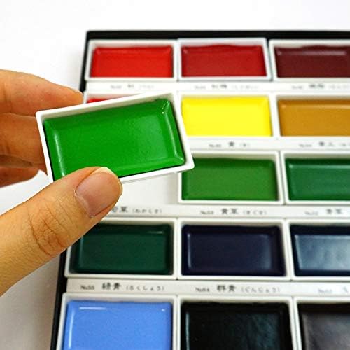
Here is a real design frustration that aggregated reviews surface consistently: Gansai Tambi comes in cardboard packaging. Not a reusable metal case. Not a hard plastic tray with a lid that functions as a palette. A cardboard box. Several reviewers explicitly note wishing Kuretake sold a compatible metal case separately, because the pans themselves are good enough to deserve a proper home. For studio use, this is a minor inconvenience — you can decant pans into a metal tin or use an empty palette. For travel and field use, it is a meaningful gap, especially at the premium 36- and 48-color tier where you are making a real investment in the set.
What Prima Confections Actually Is
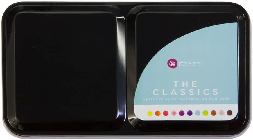
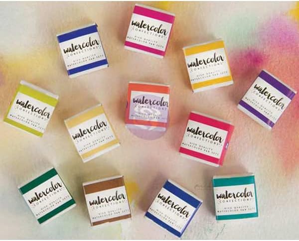
Prima Confections is a different product philosophy. Where Gansai Tambi prioritizes opaque saturation across a broad color range, Confections leans into the craft and lifestyle side of the watercolor market — sets named Tropicals, The Classics, and Complexion are selling an experience alongside the paint. The packaging is part of that: Prima Confections come in tins, which function as palettes with a built-in mixing surface and a lid that doubles as additional mixing space. Reviewers of the Complexion set specifically note the tin’s design details, signaling the product is meant to be held and used in the field, not just displayed on a desk.
But Prima Confections reviewers are more divided than Gansai Tambi reviewers on the core quality question, and the division follows set lines. The Tropicals set earns multi-year loyalty from experienced users; the color range is specific and cohesive, pigment density is praised, and repeat purchases are common in the review record. The Classics set has been called “more like student grade paints” by at least one reviewer who purchased multiple sets across the range — a comment that carries weight precisely because it comes from someone with a comparative frame of reference, not a first-time buyer. The Complexion set earns specific praise from portrait painters and travelers; the palette curation for skin-adjacent neutrals is intentional and appreciated.
This variance matters for purchasing decisions. Prima Confections is not a single product with consistent quality across all sets — it is a family of products where set identity correlates with how well the formulation serves an experienced painter.
Side-by-Side: How the Two Sets Compare
The following three sections break down the key decision dimensions using a head-to-head structure. Each section closes with a tier marker to help you place your purchase.
Opacity, Transparency, and Medium Character
Kuretake Gansai Tambi behaves like a gouache-adjacent medium. Most colors are opaque to semi-opaque, and the paint sits on the paper surface rather than soaking into the tooth. Artists Network’s coverage of watercolor opacity (artistsnetwork.com) establishes that genuine transparent watercolor allows the paper to luminously show through — Gansai Tambi does not reliably produce this effect, particularly in its darker and more saturated hues.
Prima Confections behaves closer to a conventional watercolor. Transparency varies by color within the set, but the medium is more compatible with standard watercolor technique: wet-into-wet, wet-on-dry layering, and light lifting all function more predictably than they do with Gansai Tambi. Fine Art Tips (“Gouache vs. Watercolor: What’s the Difference?,” finearttips.com) notes that when opaque and transparent mediums are mixed on a shared palette, the opaque medium typically dominates the mixture — a practical caution for painters who switch between Gansai Tambi and conventional watercolors mid-session.
Best fit by opacity preference:
- Illustrators, mixed-media artists, and painters working on toned paper → Gansai Tambi
- Loose watercolor painters, journal artists, and portrait sketchers → Prima Confections
Prima
$29.95
In stock on Amazon
Check price on AmazonPackaging, Portability, and Field Use
Prima Confections wins this category without ambiguity. The metal tin format is functional in the field: the lid provides a real mixing surface, the pan tray is stable, and the unit holds together during transport. The Complexion and Tropicals tins specifically receive praise for the usability of the lid as a palette surface, though reviewers of larger Confections sets note the mixing space is not generous — painters who prefer large wet mixing areas should plan to carry a supplementary ceramic or plastic palette.
Gansai Tambi’s cardboard packaging is the single most recurring criticism across the review record. The pans themselves are well-made. The box is not a usable field palette. Jackson’s Art blog’s coverage of Japanese watercolor products (jacksonsart.com) notes that part of the appeal of Gansai Tambi’s larger sets is the inclusion of colors specific to Japanese aesthetic traditions — particular naturalistic greens and blues with no direct Western equivalent — but none of those specialty colors resolve the packaging problem for field painters. Decanting Gansai Tambi pans into a separate metal tin or half-pan travel palette is the practical workaround most experienced users adopt.
Best fit by portability priority:
- Field painters and travel sketchers who need a functional all-in-one kit → Prima Confections
- Studio painters or those willing to invest in a separate palette case → Gansai Tambi
Art
$23.37
In stock on Amazon
Check price on AmazonColor Range, Set Consistency, and Value
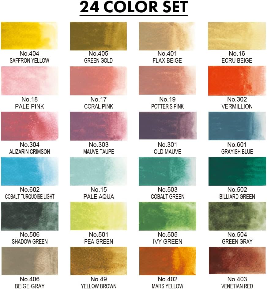
Gansai Tambi offers a significantly broader range: 12, 24, 36, and 48-color tiers with consistent quality across all of them. The 36-color set is the most consistently recommended value point in the range — broad enough to cover nearly all practical needs without the redundancy of the 48, which adds metallics, pearl pigments, and expanded warm-cool variations within color families. For painters who prefer to mix rather than select, the 24-color set covers all primaries, secondaries, and key neutrals with room to spare. The 48-color set is best justified for illustrators who use flat pre-mixed color fills and want to minimize in-session mixing.
Prima Confections’ set consistency is not uniform. Tropicals and Complexion are the sets most recommended by experienced painters. The Classics set is the one flagged most often for underperforming relative to price — with at least one multi-set reviewer describing it as feeling closer to student-grade quality. For painters drawn to Prima Confections, the Tropicals set offers the most praised range of greens, aquas, and warm earth tones for landscape work; Complexion is the most targeted and effective for portrait-oriented palettes.
Neither brand publishes individual lightfastness ratings by color — a real limitation for work intended for display or sale. Artists Network’s guidance on archival standards (artistsnetwork.com) recommends confirming ASTM lightfastness ratings (I or II) before using any paint in work sold to collectors. Without published ratings, both Prima Confections and Gansai Tambi are best treated as sketching, journaling, and practice mediums rather than archival fine art tools. Brands that do publish full pigment and ASTM rating data include Daniel Smith, Schmincke Horadam, and Sennelier.
Best fit by range and value:
- Painters who want the broadest single-brand palette with consistent quality across tiers → Gansai Tambi 36-color
- Painters who want a tightly curated thematic palette with strong color relationships → Prima Confections Tropicals or Complexion
Kuretake
$59.98
In stock on Amazon
Check price on AmazonFrequently Asked Questions
Is Kuretake Gansai Tambi a watercolor or a gouache? Gansai Tambi is marketed as a watercolor but behaves closer to gouache in practice. Traditional watercolor is transparent — you see the white paper through the paint. Gouache is opaque — it covers what is underneath. Gansai Tambi’s Japanese pigment tradition prioritizes saturation and covering power, which puts it functionally closer to gouache even though it activates similarly to pan watercolors.
Can you mix Gansai Tambi with traditional watercolors on the same palette? Yes, the medium is physically compatible. The practical issue is that Gansai Tambi’s opacity tends to dominate mixtures. As Fine Art Tips notes in their coverage of gouache versus watercolor behavior (finearttips.com), adding even a small amount of an opaque medium to a transparent wash shifts the mixture toward opacity. Painters who need to preserve transparency in specific areas should keep the two mediums on separate palettes.
Which Prima Confections set is best for landscape painting? The Tropicals set earns the most consistent praise from landscape painters — the range of greens, warm blues, and earth tone transitions mixes well for foliage and water. The Classics set is less recommended for this purpose, with some experienced reviewers describing it as feeling closer to student-grade quality.
Does the Prima Confections tin provide enough space for color mixing? The tin lid is the primary mixing surface and provides more space than the pan tray itself. It works for small washes and limited palette work. Painters who prefer large wet mixing areas — particularly for loose, washy landscape passages — will want a supplementary ceramic palette alongside it.
How do the 24-color and 48-color Gansai Tambi sets differ? The 48-color set adds metallics, pearl pigments, and expanded color family variations that reduce the need for in-session mixing. It also includes colors specific to Japanese aesthetic traditions, as noted in Jackson’s Art blog’s coverage of Japanese watercolor products (jacksonsart.com), that do not have standard Western watercolor equivalents. The 24-color set covers all practical primaries, secondaries, and neutrals and is better for painters who prefer to mix. The 36-color set is widely considered the best value-to-range ratio.
Are either of these sets appropriate for work intended for sale or display? Neither brand publishes per-color lightfastness data publicly. Artists Network recommends confirming ASTM lightfastness ratings (I or II) for any paint used in work sold to collectors (artistsnetwork.com). Without that documentation, both sets are best treated as practice and journaling tools rather than archival fine art mediums.
The Clear Decision Rule
If you paint in an illustrative, graphic, or mixed-media style — or you work on toned or dark paper and need paint that sits opaquely on the surface — Kuretake Gansai Tambi is the better tool. Budget for a separate metal palette or empty tin case, because the cardboard packaging will frustrate you within a month. Start with the 36-color set unless the specialty metallics in the 48 are specifically relevant to your practice.
If you paint loose, transparent, travel-oriented watercolor — landscapes, portraits, journaling — and you want a set that behaves closer to traditional watercolor with a cohesive thematic palette and a usable all-in-one tin, Prima Confections Tropicals or Complexion is the better fit. Avoid The Classics as your entry point into the range; the quality signal from experienced reviewers is consistent enough to take seriously. And for either brand: do not sell or display work made with these paints without running your own lightfastness test first, because neither brand gives you the documentation to skip that step.