Kuretake Gansai Tambi paints are a Japanese-made paint set sold in flat, snap-top pans — think of a pan as a small cake of solid pigment that you wet with a brush to release color. Unlike the European-style watercolors most Western artists learn on (think Winsor & Newton or Daniel Smith), Gansai Tambi come from a tradition of gansai — Japanese opaque water-based pigments historically used in ink painting and illustration. The result is a medium that sits somewhere between transparent watercolor and gouache (an opaque, matte water-based paint), and that hybrid behavior is the core thing you need to understand before deciding which set size fits your practice. This article breaks down the 24-pan and 48-pan versions, maps the real tradeoffs, and ends with a clear decision rule so you don’t spend $40 to $80 on the wrong set.
| EDITOR'S PICKKuretake GANSAI TAMBI Watercolo… | Budget pickKuretake GANSAI TAMBI Watercolo… | |
|---|---|---|
| Color count | 48 | 24 |
| Suitable for | Adults/kids | Adults |
| Non-toxic | — | ✓ |
| Price | $59.98 | $30.95 |
| See on Amazon → | See on Amazon → |
What Makes Gansai Tambi Different from Standard Watercolors
Before you can compare set sizes, it helps to understand what you’re actually buying. Reviewers across multiple platforms consistently flag the same surprise: Gansai Tambi behave more like gouache than like the transparent, luminous watercolors you’d get from a tube of Daniel Smith or Sennelier. That’s not a flaw — it’s the point — but it genuinely changes how you should work with them.
At full strength (minimal water, loaded brush), these paints are opaque and highly saturated, which means you can lay a light color over a dark one — something traditional transparent watercolor cannot reliably do. Diluted with more water, they become more translucent and can be used in washes, though they won’t achieve the same glowing transparency as single-pigment tube watercolors on cotton-rag paper. Handprint.com’s watercolor pigment surveys and paint reviews document that Japanese gansai formulations typically rely on binders and fillers that promote opacity rather than transparency — a finding consistent with what Gansai Tambi owners report across long-term use.
Practical implications for your workflow:
- Layering works differently. You’re not building luminous depth through transparent glazes; you’re working more like a gouache illustrator, with light over dark as a genuine option.
- Wet-on-wet washes are possible but softer and less controllable than with traditional watercolors — the opacity tends to muddy rather than bloom.
- For illustration, flats, and decorative work, the behavior is genuinely excellent. For loose, expressive wash painting, the learning curve is steeper.
Artists Network’s coverage of Japanese watercolor traditions notes that gansai pigments were historically optimized for paper goods, illustration, and calligraphic work — which explains why Gansai Tambi paints feel purpose-built for those applications rather than for plein air landscape work. (Source: Artists Network, “Understanding Japanese Watercolor Paints.”)
24 Colors vs. 48 Colors: The Core Comparison
Here’s where the decision actually lives. Both sets share the same paint formula and pan size — Kuretake’s pans are notably larger than most competitors’ half-pans, which is one of the most frequently cited advantages in owner reviews. Jackson’s Art’s Gansai Tambi watercolors review calls out the pan size as a genuine differentiator, noting that the larger wells make rewetting easy and reduce the frustration of scraping a dried-down half-pan with a loaded brush. (Source: Jackson’s Art, “Gansai Tambi Watercolors Review.”)
The practical differences between 24 and 48 are about palette breadth, not paint quality.
By the numbers:
| Feature | 24-Color Set | 48-Color Set |
|---|---|---|
| Pan count | 24 | 48 |
| Approximate retail | ~$30–$40 | ~$55–$75 |
| Cost per pan | ~$1.50–$1.65 | ~$1.30–$1.55 |
| Packaging | Cardboard box | Cardboard box |
| Color names on pans? | Yes | Yes |
The cost-per-pan math slightly favors the 48-set, but only if you’ll actually use the additional colors. That’s the question worth sitting with.
The 24-Color Set: Focused and Learnable
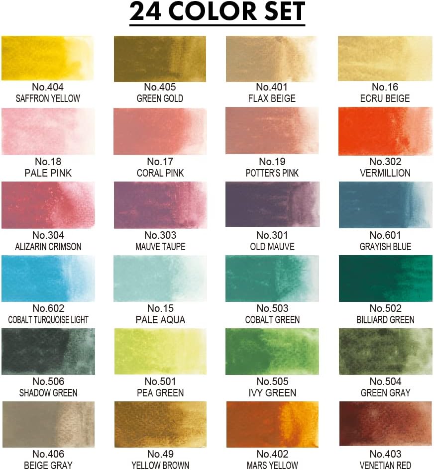
The standard 24-pan set covers a solid working range: warm and cool primaries, a useful earth palette, a few convenience mixes, and some colors that lean into the Japanese palette tradition — soft pinks, muted greens, certain grays that reflect the aesthetic Kuretake designed for. Fine Art Tips’ comparison of pan watercolor sets consistently finds that 24-color sets reward intermediate artists more than beginners because the limited range forces intentional color mixing rather than reaching for a pre-mixed convenience color. (Source: Fine Art Tips, “Pan Watercolor Sets Compared.”)
Owners who’ve reviewed the 24-set over extended use tend to describe it as “the right size to actually learn.” The 24-color range is genuinely sufficient for most practice work. You’re not going to hit a wall at 24 colors if you’re mixing intelligently.
Best for: Illustrators building a signature palette, artists transitioning from traditional watercolor who want to learn the medium’s quirks before committing to a larger set, educators using Gansai Tambi in structured projects.
Kuretake
$30.95
In stock on Amazon
Check price on AmazonThe 48-Color Set: Breadth Comes with Tradeoffs
The 48-set doubles the range and does add genuinely useful colors — expanded neutrals, additional earth tones, and some specialty colors that illustrators working in specific genres (botanicals, manga, decorative pattern work) will reach for regularly. The cost-per-pan math is marginally better, as noted above.
The honest tradeoff: reviewers consistently note that the 48-set introduces some redundancy — colors close enough in value and hue that distinguishing them in practice requires deliberate attention. If your workflow depends on moving quickly through a palette, more pans means more visual scanning time. Artists Network’s coverage of palette organization notes that professional illustrators frequently reduce large sets to a working subset anyway, which raises a legitimate question about whether the 48-pan spread works against intuitive decision-making for some users. (Source: Artists Network, “Understanding Japanese Watercolor Paints.”)
The cardboard box packaging — the most common criticism across both sets — also becomes a more acute issue at 48 pans. Keeping 48 pans organized in a flimsy cardboard tray is a genuine workflow friction point. More on that below.
Best for: Working illustrators who want a broad reference palette, artists with a defined specialty (florals, portraiture, manga) where specific hues matter, practitioners who’ve already worked through a 24-set and know exactly which colors they’re missing.
Kuretake
$59.98
In stock on Amazon
Check price on AmazonThe Art Nouveau 24-Color Set: A Specialty Option
Kuretake also produces a 24-color Art Nouveau set (sometimes listed as the “Art Nouveau” or “Starry Colors” variant), which deserves a separate mention because it’s frequently confused with the standard 24-color palette. The Art Nouveau set is not a substitute for the core palette — it’s a specialty collection with a curated color story: muted, historically referenced hues drawn from early-twentieth-century decorative arts, with some metallic or shimmer-adjacent colors depending on the version.
If your practice involves period-accurate botanical illustration, decorative pattern work, or Art Nouveau-influenced design, the specialty set may be more relevant than the standard 24. But for general illustration or watercolor practice, the standard 24-color set is the correct starting point. They’re designed for different aesthetic purposes, not different skill levels.
Best for: Artists working in period-inspired decorative styles, illustrators whose subject matter calls specifically for muted, historically grounded palettes, or practitioners who already own the standard set and want a complementary specialty range.
Kuretake
$59.98
In stock on Amazon
Check price on AmazonThe Packaging Problem (and the Fix)
Both sets ship in cardboard boxes with cardboard inner trays. This is the most consistent criticism in long-run owner reviews, and it’s worth taking seriously. The boxes are not built for travel or daily studio handling — they soften with moisture, the trays can warp, and pans can become loose or misaligned over time.
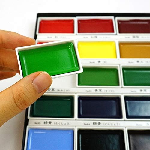
The practical fix that experienced Gansai Tambi users most commonly adopt: transfer the pans into a separate metal palette case. Kuretake’s pans are sized to fit standard half-pan slots used by most metal travel palette cases. Brands like Mijello and several generic aluminum cases are commonly cited as compatible fits by owners. The pans snap or sit securely in those slots, and you gain a durable, moisture-resistant housing with a mixing surface — features the cardboard packaging doesn’t offer.
This is worth factoring into your total cost. A mid-range metal palette case adds roughly $15–$30 to your investment. For the 48-set in particular, it may be worth treating the metal case as a near-mandatory accessory rather than an optional upgrade.
One useful feature both sets do offer: color names are printed directly on each pan. This sounds minor but gets called out repeatedly in owner reviews as genuinely practical — you don’t have to memorize positions or rely on a reference chart to know what you’re picking up, which matters when you’re mid-session.
Frequently Asked Questions
Are Gansai Tambi paints transparent like traditional watercolors or more opaque?
They’re more opaque than traditional transparent watercolors, especially at full strength with a loaded brush. Handprint.com’s watercolor pigment surveys document that Japanese gansai formulations use binders and fillers designed to promote coverage rather than transparency. (Source: Handprint.com, “Watercolor Pigment Surveys and Paint Reviews.”) Diluted with significant water, they become more translucent, but they won’t achieve the luminous, glowing transparency of single-pigment tube watercolors like Daniel Smith or Sennelier on cotton-rag paper. Think of them as sitting between transparent watercolor and gouache — closer to gouache when used at illustration strength.
Can you buy a metal palette box separately to hold the Gansai Tambi pans?
Yes, and most experienced Gansai Tambi users recommend doing exactly this. Kuretake’s pans are sized to fit standard half-pan slots found in most metal travel palette cases — brands like Mijello and generic aluminum palette cases are commonly cited as compatible fits by owners. The pans either snap into or sit securely in standard half-pan slots. This gives you a durable housing, moisture resistance, and typically a mixing surface — none of which the cardboard packaging provides.
How does the 24-color Art Nouveau set differ from the standard 24-color Gansai Tambi palette?
The Art Nouveau set is a specialty palette with a curated, historically referenced color story — muted, desaturated tones and in some versions metallic or shimmer colors — designed for decorative and period-inspired work. The standard 24-color set covers a broad working range of primaries, earths, and neutrals suitable for general illustration and watercolor practice. They serve different aesthetic purposes. If your work doesn’t specifically call for the Art Nouveau aesthetic, the standard 24-color set is the more versatile starting point.
Do these paints work well for wet-on-wet washes or are they better suited to illustration work?
They’re better suited to illustration work. Wet-on-wet technique — dropping wet paint into a wet surface to encourage blooming and soft edges — is possible but less predictable with Gansai Tambi than with transparent watercolors, because the opacity tends to produce muddier results rather than the luminous blooms you’d get from Daniel Smith or Winsor & Newton professional-grade paints on Arches paper. Artists Network’s coverage of the medium frames Gansai Tambi as illustration-first tools. (Source: Artists Network, “Understanding Japanese Watercolor Paints.”) If your practice centers on loose, expressive wash work or plein air landscape painting, traditional tube watercolors are likely a better fit.
Is the 48-color set worth the extra cost or does it introduce too many redundant colors?
It depends on your specialty. The 48-set adds genuinely useful hues — expanded neutrals, additional earth tones, specialty colors for botanical and manga work — and the cost-per-pan math is marginally better. But reviewers consistently note that some colors in the 48-set are close enough in value and hue that distinguishing them mid-session requires attention. Fine Art Tips’ pan set comparisons suggest that larger sets reward artists who already know their palette gaps more than those building their first working set. (Source: Fine Art Tips, “Pan Watercolor Sets Compared.”) If you’ve worked through a 24-set and know which specific colors you’re missing, the 48-set is a justified upgrade. If you’re starting fresh, the 24-set is less overwhelming and easier to learn.
The Decision Rule
If you’re new to Gansai Tambi or to the gouache-adjacent workflow: Start with the 24-color set. The range is sufficient for serious practice, the palette is learnable, and you’ll understand the medium’s behavior before committing to 48 pans. Budget separately for a metal palette case.
If you’ve used the 24-set and have a defined specialty — botanical illustration, manga, decorative pattern work — or you know exactly which colors you need to round out your workflow: the 48-color set is worth it, especially if the cost-per-pan math matters to you at volume.
If your work is specifically grounded in period-inspired decorative aesthetics: the Art Nouveau specialty set is worth evaluating alongside or instead of the standard 24, rather than treating it as an upgrade path from the standard palette.
Either way: Plan for a metal case. The cardboard packaging is the one consistent friction point that owner reviews agree on across all set sizes, and solving it upfront is worth the extra $15–$30.