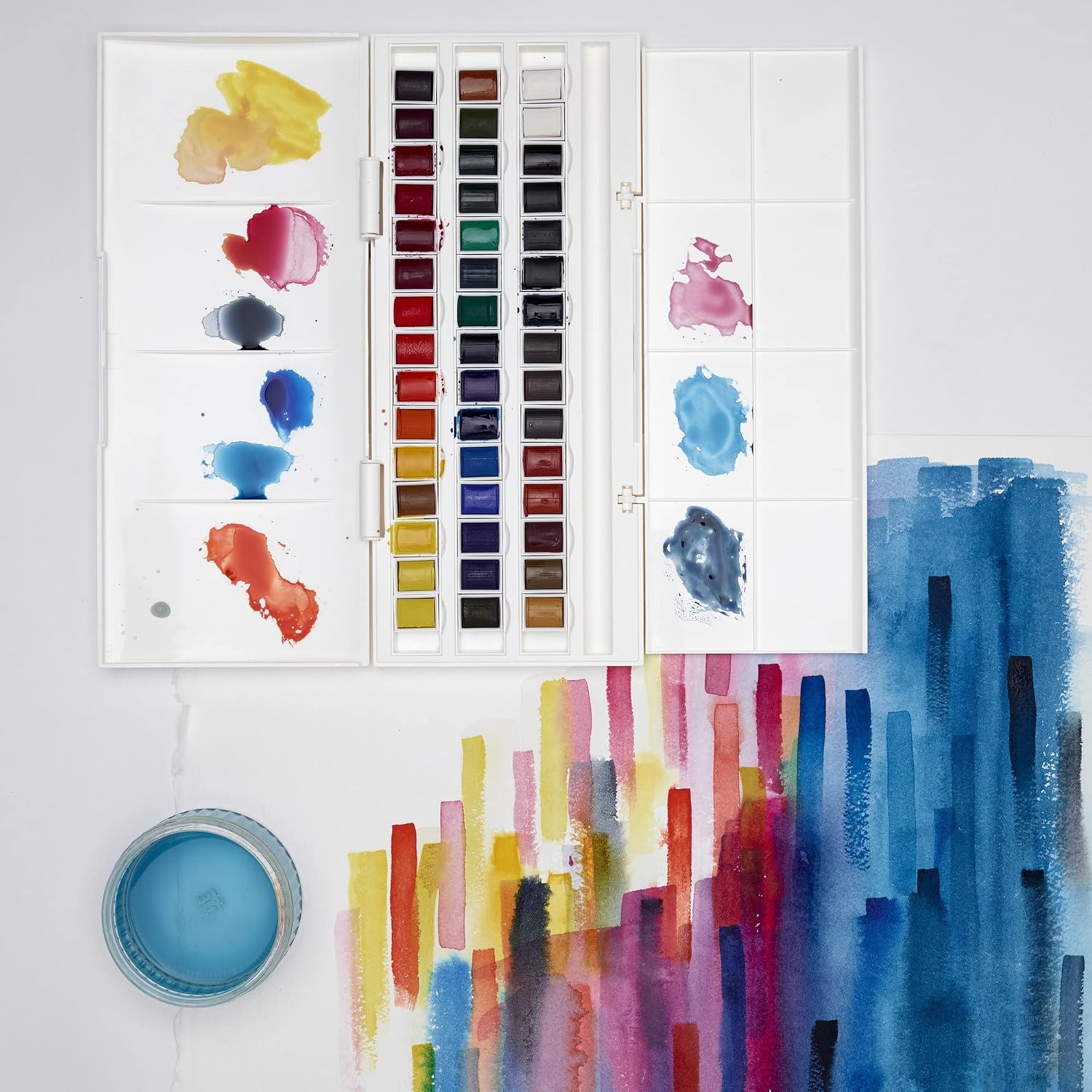
If you’ve been painting with Winsor & Newton Cotman watercolors and wondering why some professional artists talk about pigment codes like they’re stock tickers — PB29, PY150, PR264 — you’re not alone. A pigment code is simply a shorthand label that tells you exactly which chemical colorant is inside the tube. “PB” means blue pigment, “PY” means yellow, “PR” means red, and the number identifies the specific compound. Student-grade paints like Cotman often mix several cheaper pigments together to approximate a color, which can muddy mixes and fade over time. Professional-grade paints, like Daniel Smith Extra Fine Watercolors, tend to use single pigments — one code per tube — which gives you cleaner color mixing, stronger tinting strength, and colors that hold up for decades. This guide will show you what you’re actually paying for when you step up, which tubes offer the clearest upgrade, and how to make that transition without buying your whole palette twice.
| EDITOR'S PICKDANIEL SMITH Watercolor | Mid-tierWinsor & Newton Cotman Watercol… | Budget pickDANIEL SMITH 001900501 Extra Fi… | |
|---|---|---|---|
| Form | Tube | Half pan | Card |
| Number of colors | 10 | 45 | 66 |
| Size per unit | 5ml | — | — |
| Pack size | 10 tubes | — | — |
| Included brush | — | ✓ | — |
| Price | $65.82 | $52.68 | $7.73 |
| See on Amazon → | See on Amazon → | See on Amazon → |
What the Pigment Code Actually Tells You (and Why It Changes Everything)
The pigment code printed on the side of a tube is one of the most useful pieces of information a paint manufacturer can give you — and most beginners never look at it. Per Artists Network’s overview of watercolor pigment codes, the system is standardized by the Society of Dyers and Colourists, so PB29 means ultramarine blue in a Daniel Smith tube, a Sennelier tube, or a Schmincke tube. The color might behave slightly differently depending on the binder and grind, but you’re working with the same underlying mineral.
Here’s why this matters for your mixing:
Single-pigment paints mix more cleanly. When you cross two single-pigment paints, you control exactly which colorants interact. When you cross two multi-pigment paints, you might be mixing five or six different compounds at once — and some of them will neutralize each other into mud.
Cotman’s compromises are deliberate. Winsor & Newton designed Cotman as an affordable entry point, not as a permanent-collection paint. Per Jacksons Art’s comparison of student versus artist-quality watercolors, student grades typically replace expensive single pigments (like genuine cadmium) with cheaper hue formulations — two or three pigments blended to approximate the color. The result is lower tinting strength, sometimes weaker lightfastness, and less predictable behavior when mixing.
That’s not a knock on Cotman. For learning washes and getting comfortable with watercolor’s flow, it does the job. But once you’re making work you want to sell, frame, or archive, the pigment code conversation becomes non-negotiable. Artwork Archive’s guide on lightfastness ratings for selling work makes the stakes clear: a painting sold as archival that fades in ten years is a professional liability, not just an aesthetic disappointment.
The Lightfastness Layer: ASTM Ratings Decoded
Alongside the pigment code, look for the lightfastness rating — the measure of how well a color resists fading under light exposure. The industry standard is the ASTM (American Society for Testing and Materials) scale:
| ASTM Rating | What It Means | Use It For… |
|---|---|---|
| I (Excellent) | Minimal fading over 100+ years | Selling work, archival pieces |
| II (Very Good) | Slight fading in extreme conditions | Most studio and exhibition use |
| III (Fair) | Noticeable fading — avoid | Sketching only, never for sale |
| IV–V | Poor to very poor | Avoid entirely |
Handprint.com’s systematic survey of watercolor pigments — probably the most exhaustive independent reference available — notes that many student-grade colors include pigments rated III or lower, partly because cheaper organic pigments often have weaker lightfastness. Daniel Smith publishes ASTM ratings for every color in their line, and the overwhelming majority land at I or II. When you’re spending $30–$45 per tube, that rating is part of what you’re paying for.
The Upgrade Path: Five Swaps Worth Making First
You don’t need to replace your whole Cotman set at once. The highest-leverage move is to identify the five colors you reach for most and upgrade those first. Here’s a practical map of where the jump from Cotman to Daniel Smith makes the biggest real-world difference.
1. Ultramarine Blue: PB29
Cotman’s French Ultramarine is already PB29 — this is one of the few places where Cotman uses the same single pigment as professional lines. The difference in a Daniel Smith tube comes down to pigment load and grind: owners across aggregated forum discussions and retailer reviews consistently note stronger tinting strength and more dramatic granulation in the Daniel Smith version. If granulation is a tool in your practice (it’s gorgeous in architectural washes and landscape work), this upgrade is worth it. If you paint flat, even washes, the gap narrows.
2. Cadmium Yellow / Hue Gap: PY153 or PY150
This is where Cotman’s hue substitution shows up most clearly. Cotman’s Cadmium Yellow Hue is typically a multi-pigment blend approximating cadmium’s warm, opaque yellow — not a single pigment, and not cadmium. Daniel Smith offers New Gamboge (PY153) as a warm, slightly transparent near-substitute, or the more intense Hansa Yellow Deep (PY65) for a single-pigment bright. For painters wanting genuine cadmium behavior (opacity, density, high tinting strength), Daniel Smith Cadmium Yellow Medium (PY35) is the exact-formula jump, though it sits at the higher end of the price range.
Per Handprint.com’s pigment index, PY153 (nickel dioxine yellow) earns an ASTM I rating and mixes with unusual clarity into greens — it’s become a staple in many professional palettes precisely because it punches above its price point.
3. Burnt Sienna: PR101 / PBr7
Cotman Burnt Sienna is typically PBr7 — the natural iron oxide earth, and actually a reasonable single-pigment paint. But Daniel Smith’s Burnt Sienna offers a noticeably richer granulation and deeper pigment saturation at the same code. More importantly, Daniel Smith’s lineup gives you immediate access to adjacent single-pigment earth tones — Raw Umber (PBr7), Quinacridone Burnt Scarlet (PR206), and Transparent Red Oxide (PR101) — that expand your warm-palette toolkit significantly. These are all single pigment, all ASTM I or II, and they mix with remarkable transparency.
4. Phthalo Green: PG7
This is the upgrade that most intermediate painters report as genuinely revelatory. Cotman’s Phthalo Green is multi-pigment in several formulations; Daniel Smith’s is single-pigment PG7 with an intensity that intermediate practitioners consistently describe as almost violent — a little goes a very long way. At full strength it’s almost too powerful, but diluted it creates the most luminous transparent darks and forest greens available in watercolor. Crucially, because it’s single-pigment, it mixes predictably: cross it with PY153 and you get clean spring greens; cross it with PB29 and you get deep teal without graying out.
5. A Genuine Quinacridone: PR122 or PV19
Cotman’s reds and pinks often lean on multi-pigment hue blends. Quinacridone pigments — the PR and PV family — are synthetic organics that are both intensely transparent and ASTM I rated, which makes them the workhorses of professional watercolor palettes. Daniel Smith Quinacridone Rose (PV19) is the single most useful addition for painters who mix their own purples and violets: it glazes beautifully, lifts cleanly, and crosses with Phthalo Blue (PB15) to make the cleanest violet range available without reaching for a pre-mixed purple.
The Cost Math: Is It Actually Worth It?
Let’s put numbers to this, because the sticker shock on a Daniel Smith tube is real.
By the Numbers
- Cotman 8ml tube: approximately $5–$7 → ~$0.75/ml
- Daniel Smith 15ml tube: approximately $16–$22 at mid-range colors → ~$1.10–$1.45/ml
- Daniel Smith 5ml tube (primaries): approximately $8–$11 → ~$1.60–$2.20/ml
At first glance, Daniel Smith runs roughly 2× the per-ml cost of Cotman. But pigment load changes the equation. Owners across multiple retailer review aggregates consistently note that Daniel Smith tubes require significantly less paint per wash than Cotman to achieve equivalent saturation. Jacksons Art’s comparison guide notes that artist-grade paints can have two to three times the pigment concentration of student grades — which means a 15ml Daniel Smith tube may effectively outlast two or three Cotman tubes in practical use, especially for high-intensity colors like Phthalo Green or Quinacridone Rose. The cost-per-use math narrows considerably once you factor in concentration.
If X, Then Y: Your Decision Framework
If you’re making work you plan to sell or exhibit → upgrade lightfastness first. Replace any Cotman color rated below ASTM II before anything else. Quinacridone Rose and the phthalo family are the fastest wins.
If your mixes keep going gray or muddy → upgrade to single-pigment tubes. Check your current tubes’ ingredient lists: any tube listing two or more pigment codes is a candidate for replacement. Start with your most-used mixing partners.
If your budget is limited → don’t buy a full Daniel Smith set. Buy five single-pigment tubes across warm yellow, warm red, cool red, blue, and green. That’s a complete mixing palette for under $100 and covers 90% of what a full Cotman set can make — more cleanly and with better archival results.
If you’re painting en plein air and portability matters → consider Daniel Smith’s half-pan sets or individual empty half-pans to fill from tubes. The pigment loads well into pans and rewets reliably, which owners in travel-palette discussions consistently call out as a key advantage over many student grades that become chalky on rewetting.
The Cotman set that got you here was a good tool. The upgrade isn’t about abandoning it — it’s about knowing, color by color and pigment by pigment, exactly where the professional-grade difference shows up in your work. Start with one tube. Check the code. Watch what happens when you mix it clean.