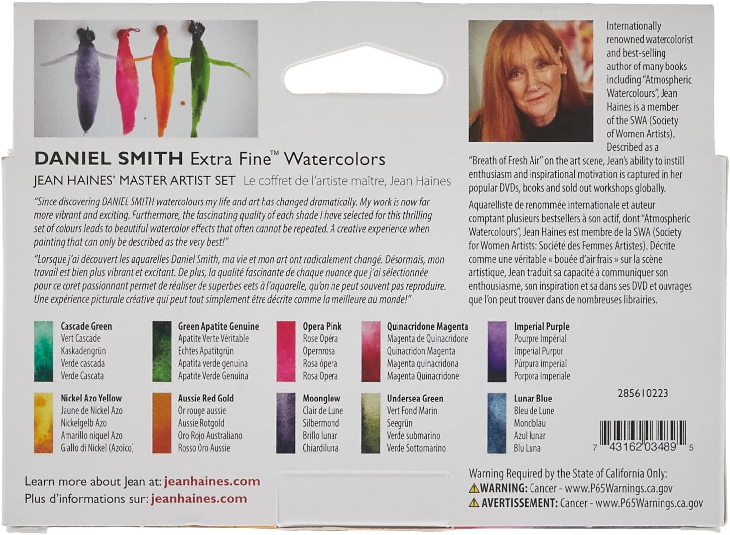
Daniel Smith Extra Fine Watercolors are professional-grade paints — meaning the pigment load (the actual color material suspended in the binder) is high enough that a little goes a long way, and the colors behave in ways that cheaper student paints simply can’t replicate. Granulation, for instance, is the tendency of certain pigment particles to clump and settle into the texture of the paper, creating a natural, uneven bloom that looks atmospheric and organic rather than flat. Daniel Smith’s master artist sets are curated collections of 6–10 tubes assembled around a specific painter’s palette or working style. They’re not random samplers — each one reflects deliberate choices about subject matter, color temperature, and mixing strategy. This guide breaks down three of the most-discussed sets — Jean Haines, Pablo Rubens Blues, and Michael Solovyev — and helps you decide which one actually fits the way you paint, plus flags what the Essentials Introductory set gets right as an entry point before you commit to a themed collection.
The Essentials Introductory Set: Your Baseline Before You Go Further
Before comparing the master artist sets, it’s worth understanding where most buyers start: the Daniel Smith Essentials Introductory 6-tube set. This is the lowest-cost entry into the Daniel Smith lineup, and reviewers across multiple retail platforms consistently describe the same arc — they were using significantly more paint than necessary because they were calibrated to cheaper pigments, and the moment they adjusted their loading, the extra-fine quality became obvious.
That learning curve matters because it’s the same experience buyers carry into the master sets. If you’re currently working through the Essentials set and wondering whether a themed palette is a meaningful upgrade or just a repackaging play, the honest answer is: the overlap is minimal and the intent is entirely different.
The Essentials set is a general-purpose foundational palette — primaries plus a few workhorses. The master artist sets are subject-matter-specific. They assume you already have a functional palette and are expanding toward something more intentional: a signature atmospheric effect, a landscape-dominant color range, or a portrait and flora palette with built-in granulation behavior. If you’ve finished your Essentials tubes and find yourself reaching for more nuanced blues or warmer earth tones, that’s the signal to step into one of the themed sets.
Jean Haines’ World of Watercolour Set: Built for Atmosphere and Loose Mark-Making
Jean Haines is a UK-based watercolorist known for intuitive, loose, highly atmospheric work — flowers, birds, and figures that feel more like impression than record. Her curated set reflects that sensibility directly.
The two colors that dominate buyer conversations are Moonglow and Lunar Blue, and they deserve specific attention because they’re genuinely unlike anything in a standard palette.
Moonglow (PB29, PR101, PBk11) is a granulating, dark neutral that shifts between violet, brown, and blue depending on dilution and paper surface. Handprint.com’s pigment documentation notes that multi-pigment granulating mixtures like Moonglow create unpredictable particle separation that single-pigment paints can’t replicate — the effect emerges from the interaction of the component pigments settling at different rates. Painters report that Moonglow in wet-on-wet washes creates backgrounds that look like storm light or deep water without any layering. It’s the kind of color that changes how you think about mixed darks.
Lunar Blue is the one that consistently surprises buyers most. It contains a synthetic iron-based pigment with magnetic-particle behavior — when applied wet, the particles visibly migrate and cluster, creating textures that look like cracked earth, denim weave, or mineral deposits. Artists Network’s overview of granulating watercolors identifies iron-based pigments as the most dramatic granulators precisely because of this particle weight differential. Reviewers on multiple platforms describe seeing Lunar Blue move in the wash and immediately understanding why the price point is justified.
If your subject matter is: landscapes, atmospheric portraiture, botanicals where you want the background to carry mood — the Jean Haines set is built for this. The granulating colors reward loose technique and punish overworking. If you tend to paint tight and controlled, these colors will fight you.
If your subject matter is: architecture, flat graphic work, or anything requiring clean, smooth washes — the granulation in this set is an obstacle, not a feature.
Pablo Rubens’ Blues Set: A Mixing Palette in Disguise
The Pablo Rubens Blues set is positioned as a landscape-focused collection, but buyers who look at it that way miss what it actually is: a serious, professionally curated blue mixing palette that works across subject matter.
The set covers a deliberate spread of the blue spectrum — from the warm, reddish blues (useful for shadow and skin tone mixing) to the cool greenish blues (critical for precise sky and water color). Buyers consistently report that the set functions as a self-contained chromatic range rather than a group of similar colors. The hue temperatures within the blue family are spaced intentionally.
One honest signal worth flagging: reviewers who have worked through this set often note that Opera Pink — which appears in some Daniel Smith sets — is the one outlier they’d remove from a mixing-focused palette. Opera Pink (PR122, optical brightener) is a fluorescent, non-lightfast color. Fine Art Tips’ overview of lightfastness standards notes that fluorescent pinks carry ASTM lightfastness ratings in the III–IV range, meaning they will fade measurably under prolonged exhibition conditions. If you’re creating work for sale or long-term display, that’s a material consideration. Opera Pink is gorgeous for illustration and process work; it’s not archival.
By the numbers:
| Color type | ASTM Lightfast Rating | Archival for sale? |
|---|---|---|
| Single-pigment DS blues (PB29, PB15) | I–II | Yes |
| Opera Pink (PR122 + optical brightener) | III–IV | No |
| Moonglow (multi-pigment) | I–II | Yes |
For painters who don’t primarily paint landscapes: the Pablo Rubens Blues set is still genuinely useful. Portrait painters need blues to neutralize warm flesh tones in shadows. Still-life painters need them for backgrounds and shadow masses. The set’s value is in the range of blue temperature it covers — that’s relevant regardless of subject matter. What it lacks is strong warm chromatic colors, so treat it as an expansion palette, not a standalone one.
Michael Solovyev Set: The Overlooked One Worth Knowing
The Michael Solovyev set is less discussed in review culture than the Haines or Rubens sets, but buyers who seek it out tend to be more specifically motivated — they know Solovyev’s detailed, richly chromatic work and want the palette that supports that visual language.
Solovyev’s approach leans toward complex, layered color mixing with high chroma. His curated set tends to include paints with strong single-pigment purity — which matters enormously for mixing clarity. Jackson’s Art Blog’s review of Daniel Smith’s range notes that single-pigment paints produce cleaner secondary mixes because there’s no mudding from unexpected third or fourth pigments interacting. If you’re building layered work where color mixing precision is the point — detailed botanical illustration, wildlife work, figurative painting with complex flesh tones — the Solovyev set’s pigment architecture is designed for that kind of control.
Artwork Archive’s guidance on choosing professional watercolors emphasizes that pigment codes on the tube are the most reliable signal of mixing behavior, and the Solovyev set is worth examining tube by tube against your existing palette before purchasing to identify genuine gaps.
How Granulating Colors Behave Differently on Cotton vs. Wood-Pulp Paper
This is one of the most practically important questions for buyers considering any Daniel Smith granulating set, and it’s worth addressing directly.
Cotton-rag paper (like Arches cold-press or Fabriano Artistico) has a longer, more open fiber structure that physically cradles granulating pigments. The particles settle into the valleys of the texture and stay there, creating defined granulation patterns that are crisp and controllable. Wet-on-wet washes on cotton paper give granulating colors time to move before the paper’s sizing slows absorption.
Wood-pulp paper (like Canson XL or Strathmore 300-series) absorbs water faster and has a shorter fiber structure. Granulating pigments on wood-pulp paper tend to granulate less dramatically — the paper pulls moisture out of the wash before the particles have time to migrate. The effect is often muddier and less defined. Reviewers working through granulating palettes consistently report that the difference between cotton and wood-pulp paper is more apparent with granulating colors than with any other type of watercolor.
Decision rule: If you’re buying a granulation-heavy set like Jean Haines’, budget for cotton-rag paper in the same order. Arches cold-press is the standard reference surface. Using granulating Daniel Smith colors on wood-pulp sketchbook paper will give you a misleading read on what the paints can do.
How to Verify Your Daniel Smith Tubes Are Genuine
One real trust issue in the Daniel Smith market is worth naming plainly: counterfeit and used-condition tubes do surface through third-party Amazon sellers. A buyer reviewing the Jansen Kors set (a separate DS curated collection) reported receiving tubes that appeared used — paint around the threads, caps that showed handling wear. This is not a Daniel Smith production issue; it’s a third-party seller problem, and it’s documented enough to warrant caution.
How to protect yourself:
- Buy from Daniel Smith’s authorized retailer network. The brand publishes an authorized dealer list. When purchasing through any marketplace, check that the seller is an authorized US retailer, not a third-party reseller with no brand relationship.
- Inspect immediately on arrival. Genuine DS tubes ship with clean threads and sealed, uncompressed caps. Paint around the threads or a cap that shows torque wear is a red flag.
- Check the label printing. Authentic Daniel Smith labels have consistent, high-resolution pigment code printing. Fuzzy or slightly misaligned text is a counterfeit signal.
- Report and return immediately. Marketplace buyer protection covers misrepresented product condition — used paint sold as new is a clear case.
Frequently Asked Questions
Are the Daniel Smith master artist sets worth buying if you already own the DS Essentials Introductory set, or do they overlap too much?
Overlap is minimal. The Essentials set is a generalist foundation palette; the master sets are subject-specific expansions built around a particular painting sensibility. If you’ve worked through the Essentials tubes and have a clearer sense of your subject matter and style, a master set is a logical next step — not a redundancy.
What makes Moonglow and Lunar Blue unique enough to justify buying a whole set just to get them?
Both colors produce effects that can’t be reasonably mixed from standard palette primaries. Moonglow’s multi-pigment granulation creates tonal shifts that emerge unpredictably in the wash. Lunar Blue’s magnetic particle behavior produces visible, organic movement in wet paint. Handprint.com’s pigment documentation confirms that these optical behaviors are tied to specific pigment combinations that no generic mixing strategy replicates.
How do granulating Daniel Smith colors behave differently on cotton paper versus wood-pulp paper?
Cotton-rag paper supports full granulation — particles settle into fiber valleys and stay defined. Wood-pulp paper absorbs moisture faster, interrupting particle migration and producing muddier, less dramatic results. Granulating sets show their full behavior only on quality cotton paper.
Is the Pablo Rubens Blues set useful for painters who don’t primarily paint landscapes?
Yes. The set’s value is its coverage of blue temperature — from warm reddish blues to cool greenish blues — which is relevant for portrait, still life, and figurative work wherever shadow mixing or color neutralization is needed. It’s an expansion palette rather than a standalone palette for non-landscape painters.
How do I tell if Daniel Smith tubes I received on Amazon are genuine and not used or counterfeit?
Check for clean threads, uncompressed caps, and sharp label printing on arrival. Buy from sellers identified on Daniel Smith’s authorized dealer list rather than third-party marketplace resellers. Report condition issues immediately through marketplace buyer protection — used paint sold as new qualifies as misrepresentation and is returnable.