Choosing watercolor paper feels deceptively simple until you realize the surface is doing half the painting. Watercolor paper comes in different textures — or “tooth,” the degree of roughness on the sheet’s face — and the two most common are cold press and hot press. Cold press paper is made by pressing pulp through textured felts as it dries, leaving a slightly bumpy, irregular surface. Hot press is run through heated metal rollers, which iron the surface nearly smooth. That difference in texture changes how pigment spreads, where water pools, and whether your brushwork looks loose and luminous or tight and controlled. If you’ve been painting for a year or two and still picking paper mostly by brand recognition or price, this guide will help you make the choice deliberately — and show you where each surface pays off or fights back.
| EDITOR'S PICKFabriano Studio Watercolor Pad | Mid-tierArches Watercolor Paper Pad | Budget pickCanson XL Series Watercolor Pad | |
|---|---|---|---|
| Surface | Hot-press | Cold-press | — |
| Weight | 140 lb | 140 lb | — |
| Sheets | 50 | — | 30 |
| Binding | — | — | Foldover |
| Price | $27.48 | $23.50 | $11.37 |
| See on Amazon → | See on Amazon → | See on Amazon → |
What the Surface Is Actually Doing to Your Paint
When a loaded brush hits paper, three things happen almost simultaneously: the water begins to absorb into the fiber, pigment particles start to settle, and surface tension determines how far the bead of paint travels before it stops. Texture governs all three.
On cold press, the small peaks and valleys of the surface create micro-reservoirs where pigment pools. This is where granulating pigments like PB29 (ultramarine blue) or manganese-based earth pigments do their most dramatic work — the heavier mineral particles settle into the low points, the finer particles ride up onto the peaks, and you get that characteristic stippled granulation that’s impossible to fake in post. The rougher surface also slows the travel of a wet bead, giving you slightly more control over how far a bloom spreads before you need to intervene.
On hot press, the smooth face offers almost no mechanical grip. Pigment has nowhere to hide, so flat washes sit dead-even — which is either a gift or a curse depending on what you’re painting. Brushstrokes register with precision: fine lines, calligraphic marks, and layered glazes read cleanly. But wet-on-wet blooms travel fast and far on a smooth surface, and any hesitation in a brushstroke can leave a tide line before you’ve had a chance to correct it. The learning curve is real. Handprint.com’s comprehensive reference document “Watercolor Supports: Paper” describes hot press as unforgiving of slow, tentative brushwork — a characterization that consistently holds up across practitioner experience at every level.
Rough press (a third texture most buyers overlook) is essentially cold press pushed further — more pronounced tooth, more dramatic granulation, harder to achieve smooth flat washes. It earns a mention here because if you love cold press behavior, rough is worth one deliberate experiment before you commit to a surface for a body of work.
The Practical Behavior Gap
These are the scenario-based tradeoffs that matter when you’re planning a body of work, not just a single painting. The comparison below is organized into three tiers of use case — from practice-level needs through mid-range studio work to professional finished pieces.
H3: Practice and Exploration
When you’re doing color studies, testing new pigments, or building brush confidence, the surface tradeoffs are less about final results and more about feedback quality. Cold press gives you more margin: texture softens uneven edges, slows blooms, and makes granulation visible early so you can see what a pigment is actually doing. Hot press at the practice tier can be actively discouraging — without the texture to slow things down, every hesitation marks the sheet, and early-stage students often interpret the surface’s punishing feedback as personal failure rather than a calibration problem.
The recommendation at this tier: use cold press as your default practice surface, and treat any hot press sheets as deliberate experiments with specific goals, not open-ended exploration.
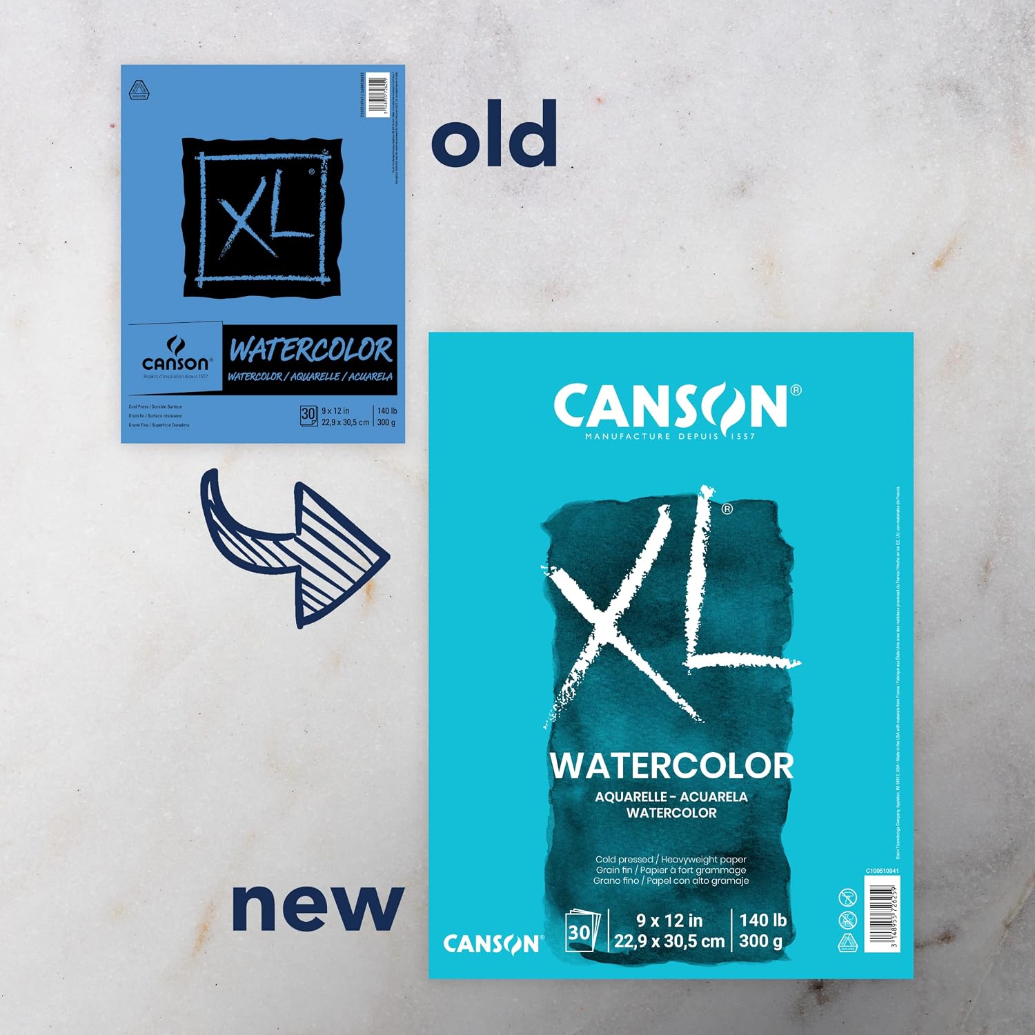
Canson
$11.37
In stock on Amazon
Check price on AmazonH3: Mid-Range Studio Work
At the intermediate studio level — finished studies, series work, paintings intended to be shown or sold in modest editions — surface choice starts to align with subject matter. Artists Network’s editorial guide “Hot Press vs. Cold Press Watercolor Paper” draws a consistent line between subject types: loose landscapes, atmospheric skies, and organic forms reward cold press texture, while illustration, architectural rendering, and ink-and-wash mixed media reward hot press precision.
The practical behavior gap is clearest here. Cold press at 140 lb / 300 gsm is forgiving of the wet-on-wet layering that characterizes studio-scale watercolor work — the fiber holds lifted areas without tearing, and re-wetting dried layers doesn’t cause the surface to pill. Hot press at the same weight requires faster, more committed brushwork but pays off in glazes that sit clean and edges that stay exactly where you put them.
Jackson’s Art Blog’s published overview “A Guide to Watercolour Paper” notes that Arches cold press and Fabriano Artistico cold press behave differently from each other even within the cold press category — Arches carries a harder sizing that allows more time to manipulate wet paint, while Fabriano Artistico is softer-sized and absorbs more quickly. That distinction matters at the studio level: if you’re losing control of wet-on-wet, switching from Fabriano to Arches before abandoning cold press entirely is a worthwhile intermediate step.
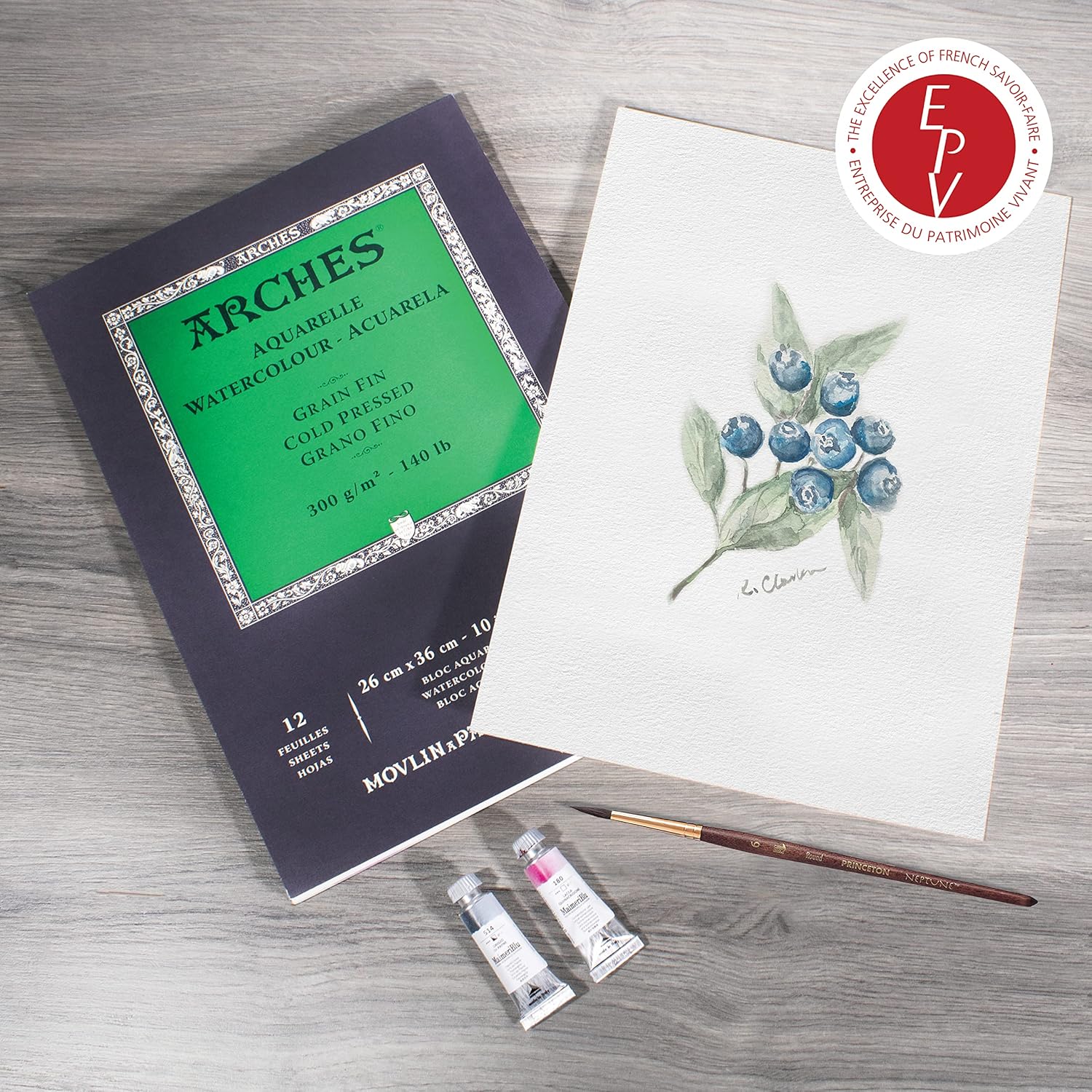
Arches
$23.50
In stock on Amazon
Check price on AmazonH3: Professional and Archival Finished Work
For work that leaves your studio — sold pieces, exhibition submissions, commissioned illustrations — the surface decision intersects with archival requirements in ways that eliminate some options entirely. Artwork Archive’s resource “How to Choose Watercolor Paper” addresses the archival question directly: wood-pulp paper yellows and becomes brittle within years under normal ambient conditions. For finished work, 100% cotton rag, acid-free, archival-grade paper is not an aesthetic preference — it’s a professional standard.
At this tier, both cold press and hot press are available in archival cotton-rag grades from every major mill. The surface choice returns to subject matter and technique: botanical illustrators and scientific illustrators working in tight detail consistently favor hot press (Fabriano Artistico hot press is specifically praised in this context in Artists Network editorial coverage). Painters working in expressive or landscape traditions at professional scale favor cold press or rough, with Arches 300 lb / 640 gsm as the most frequently cited choice for large-format work where constant re-wetting is part of the process.
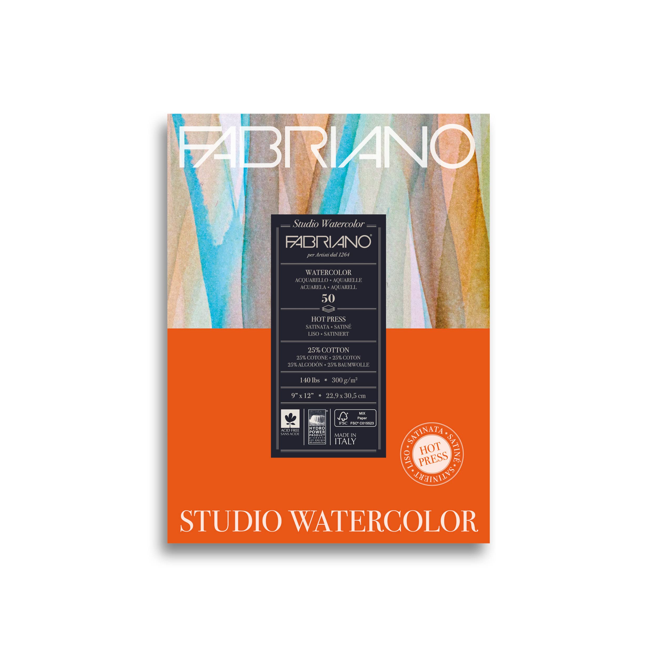
Fabriano
$27.48
In stock on Amazon
Check price on AmazonBy the Numbers: Weight, Cotton Content, and Price
| Spec | Entry / Practice | Mid-Range | Professional |
|---|---|---|---|
| Weight | 90 lb / 185 gsm | 140 lb / 300 gsm | 300 lb / 640 gsm |
| Fiber | Wood pulp | Cotton-rag blend or 100% cotton | 100% cotton rag |
| Price per sheet (approx., 2026) | $0.30–$0.80 | $1.50–$3.50 | $5.00–$12.00+ |
| Archival status | Non-archival | Acid-free, variable lightfastness | Acid-free, archival, museum grade |
The weight figure matters for a specific reason: lightweight paper at 90 lb buckles badly when wet, even when stretched, and that buckling changes how paint flows mid-stroke. Artists Network’s editorial guide on hot press vs. cold press recommends 140 lb / 300 gsm as the minimum for serious studio work — it’s the threshold where you can paint without pre-stretching on smaller formats under roughly 9×12 inches. At 300 lb / 640 gsm, the sheet barely moves when saturated, which is why it’s the preferred weight for large-format botanical and plein air work where re-wetting is constant.
Matching Paper to Pigment
This is the variable that intermediate practitioners underestimate most. The paper-pigment pairing is not additive — it’s multiplicative. A pigment that is moderately interesting on cold press can become spectacular or inert depending on the surface.
Single-pigment earth tones and mineral pigments — PBr7 (raw umber), iron oxide series, and quinacridone-family reds — behave differently depending on surface. On cold press, particularly Arches cold press with its pronounced tooth, these pigments granulate visibly and create organic, uneven texture that reads like genuine sediment. On hot press, those same pigments flatten into an even, smooth film — sometimes beautifully controlled, sometimes without character.
Transparent staining pigments — Phthalo blue (PB15), phthalo green (PG7), quinacridone magenta (PR122) — stain the fiber on contact and are difficult to lift regardless of surface. On cold press, the texture gives the illusion of more luminosity because the pigment pools into low points and leaves peak-tips lighter. On hot press, the stain is absolute and even, which reads as intensely saturated but doesn’t carry the same light-reflection quality that makes watercolor distinctive as a medium.
Handprint.com’s “Watercolor Supports: Paper” reference covers sizing behavior in depth and explains why two sheets with the same texture designation can still behave differently: harder sizing delays absorption, giving you more open working time; softer sizing absorbs faster and makes wet-on-wet more difficult to control. That variable operates independently of surface texture and is worth checking when you switch between manufacturers.
The Professional-Grade Paper Landscape
For practitioners spending in the mid-to-premium range on surfaces, here’s how the major mills sort by behavior:
Arches (Canson group, France) — the default reference point for cold press in North America and Europe. 100% cotton, acid-free, available in cold press, hot press, and rough. The cold press tooth is moderate — more texture than Fabriano, less than rough-grade sheets. The hard sizing makes it the most forgiving high-end surface for intermediate painters because of the extended working time it allows.
Fabriano Artistico (Italy) — softer sizing, slightly warmer white, more absorbent cold press surface. Frequently recommended for painters who prefer more spontaneous, fast-absorbing results. The hot press version is particularly well-regarded among botanical illustrators, as noted in Artists Network editorial coverage of technical surfaces.
Saunders Waterford (St. Cuthberts Mill, UK) — 100% cotton, slightly different tooth profile on cold press. Jackson’s Art Blog’s “A Guide to Watercolour Paper” rates it as one of the closest competitors to Arches in handling characteristics. US availability has been variable; UK and European buyers have more consistent access.
Canson Montval and XL — wood-pulp or mixed-fiber surfaces aimed at the practice and student tier. Not archival at the student grade, but widely used for studies and color testing before committing to cotton-rag sheets. Artwork Archive’s “How to Choose Watercolor Paper” recommends treating wood-pulp sheets as consumable study material rather than surfaces for finished work.
Strathmore 400 and 500 Series — the accessible domestic US option. The 400 series is mixed fiber; the 500 series moves to 100% cotton. Both available in cold and hot press. Reliable for intermediate practice, particularly for painters building volume of work without premium per-sheet costs.
If X, Then Y: The Decision Rules
If you paint landscapes, botanicals with loose backgrounds, or want to explore granulating pigments → cold press is your baseline surface. Start with Arches 140 lb if you’re committing to cotton-rag, or Strathmore 400 for studies. The texture supports the way wet watercolor naturally wants to behave.
If you work in illustration, tight realism, ink-and-wash, or any subject where line quality and edge precision matter → hot press is worth a committed trial, not just a one-sheet experiment. Plan to paint five pieces on it before you evaluate. The first two will likely frustrate you; the surface clicks after you recalibrate your water load and brush speed.
If you’re currently on 90 lb paper → the single highest-return upgrade in your practice is moving to 140 lb / 300 gsm before you decide anything else about surface texture. Buckling paper changes behavior so dramatically that surface comparisons made on lightweight sheets don’t transfer reliably to heavier grades.
If you sell work or intend to → 100% cotton, acid-free, archival is non-negotiable. As Artwork Archive’s “How to Choose Watercolor Paper” makes plain, the archival question for finished work is a professional obligation, not an aesthetic one.
If you’re building a single-pigment palette → do your pigment testing on the surface you intend to use for finished work. Granulation behavior, drying time, and reactivation all vary enough between cold press and hot press that color notes made on one surface won’t reliably predict results on the other.
The paper is not passive. It’s a collaborator with a strong opinion. Choose the one whose opinion matches the painting you’re trying to make.
Sources: Handprint.com, “Watercolor Supports: Paper”; Jackson’s Art Blog, “A Guide to Watercolour Paper”; Artists Network, “Hot Press vs. Cold Press Watercolor Paper”; Artwork Archive, “How to Choose Watercolor Paper.”